How to Pair Fonts in Graphic Design: Achieving Contrast and Visual Balance
Choosing the right fonts can make or break a design. As a graphic designer, it’s important to understand how to pair fonts to achieve contrast and visual balance. The right combination of fonts can enhance the message you’re trying to convey and make your design stand out.
Contrast is key when pairing fonts. You want to choose fonts that have different styles, weights, and sizes. This will create a visual hierarchy and help guide the viewer’s eye through the design. On the other hand, visual balance is about choosing fonts that complement each other and work together harmoniously.
When it comes to pairing fonts, there are a few basic rules to follow. First, limit the number of fonts you use in a design to two or three. Any more than that can be overwhelming and confusing. Second, consider the mood and tone of the design and choose fonts that reflect that. For example, a playful design may call for a more whimsical font while a professional design may require a more traditional font.
In this article, we’ll explore different font pairings and techniques for achieving contrast and visual balance in your designs. By following these tips, you’ll be able to create designs that are not only visually appealing but also effectively communicate your message.
Understanding Font Pairing
Font pairing is the process of choosing and combining two or more fonts for use in a design project. It involves selecting fonts that complement each other, create contrast, and achieve visual balance. Font pairing is an essential aspect of graphic design as it can make or break the overall look and feel of a design.
What is Font Pairing?
Font pairing is the art of combining fonts to create a harmonious and visually appealing design. It involves choosing fonts that complement each other and create contrast to enhance the visual hierarchy of the design. When done correctly, font pairing can add depth and personality to a design, making it more memorable and engaging.
Why is Font Pairing Important?
Font pairing is important because it can significantly impact the overall effectiveness of a design. Choosing the wrong fonts can result in a design that looks cluttered, unprofessional, and difficult to read. On the other hand, pairing fonts correctly can enhance the visual hierarchy of the design, making it easier to read and understand.
Font pairing can also help to establish a brand’s identity by creating a consistent look and feel across various marketing materials. Consistent use of fonts can help to build brand recognition and increase brand awareness.
Additionally, font pairing can help to create a sense of hierarchy in a design. By using different fonts for headings, subheadings, and body text, designers can guide the viewer’s eye through the content, making it easier to understand and digest.
Overall, font pairing is a crucial aspect of graphic design that should not be overlooked. By selecting the right fonts and combining them in a harmonious way, designers can create visually appealing designs that effectively communicate their message.
Types of Font Pairing
Choosing the right combination of fonts is crucial in graphic design. It can make or break the visual appeal of your design. Here are some types of font pairing that you can use to achieve contrast and visual balance:
Contrasting Fonts
Contrasting fonts are those that are very different from each other. They are used to create visual interest and draw attention to specific elements of the design. For example, pairing a bold, thick font with a thin, delicate font can create a striking contrast that adds depth to your design.
Complimentary Fonts
Complimentary fonts are those that have similar characteristics and work well together. They are used to create a cohesive look and feel in your design. For example, pairing a serif font with a sans-serif font can create a balanced and harmonious design.
Similar Fonts
Similar fonts are those that have subtle differences in style but are still very similar. They are used to create a subtle contrast and add depth to your design. For example, pairing two different sans-serif fonts with similar characteristics can create a cohesive and modern design.
Monospace Fonts
Monospace fonts are those that have equal spacing between each character. They are used to create a clean and modern look in your design. For example, pairing a monospace font with a sans-serif font can create a contemporary and minimalist design.
Sans Serif Fonts
Sans-serif fonts are those that do not have the small lines or flourishes at the end of each character. They are used to create a clean and modern look in your design. For example, pairing a sans-serif font with a serif font can create a balanced and elegant design.
| Type of Font Pairing | Description |
|---|---|
| Contrasting Fonts | Very different fonts used to create visual interest and draw attention to specific elements of the design |
| Complimentary Fonts | Similar fonts that work well together to create a cohesive look and feel in your design |
| Similar Fonts | Fonts that have subtle differences in style but are still very similar, used to create a subtle contrast and add depth to your design |
| Monospace Fonts | Fonts that have equal spacing between each character, used to create a clean and modern look in your design |
| Sans Serif Fonts | Fonts that do not have the small lines or flourishes at the end of each character, used to create a clean and modern look in your design |
Choosing the Right Fonts
When it comes to pairing fonts in graphic design, choosing the right fonts is crucial. The fonts you choose should not only be visually appealing but also convey the message you want to send. Here are some tips to help you choose the right fonts:
Consider the Purpose of the Design
The first step in choosing the right fonts is to consider the purpose of the design. Are you designing a logo for a business? Or are you creating a poster for an event? The purpose of the design will determine the type of fonts you should use.
Think About the Message You Want to Convey
The message you want to convey should also influence your font choices. If you want to convey a serious or formal message, you may want to choose a serif font. On the other hand, if you want to convey a fun or casual message, a sans-serif font may be more appropriate.
Play with Font Sizes and Weights
Playing with font sizes and weights can also help you achieve contrast and visual balance. Use larger fonts for headlines and smaller fonts for body text. You can also use bold and italicized fonts to add emphasis.
Limit the Number of Fonts
While it may be tempting to use a variety of fonts, limiting the number of fonts you use can help you achieve a more cohesive and professional look. Stick to two or three fonts at the most and make sure they complement each other.
| Font Type | Message | Examples |
|---|---|---|
| Serif | Serious, formal | Times New Roman, Georgia |
| Sans-serif | Casual, modern | Arial, Helvetica |
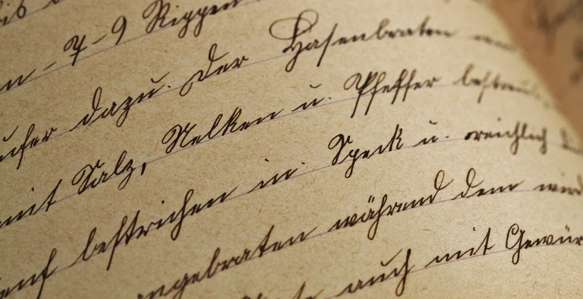
| Script | Elegant, feminine | Lucida Calligraphy, Brush Script |
By considering the purpose of the design, thinking about the message you want to convey, playing with font sizes and weights, and limiting the number of fonts, you can choose the right fonts to achieve contrast and visual balance in your graphic design projects.
Creating Visual Balance
When it comes to pairing fonts in graphic design, achieving contrast and visual balance is key. Here are some tips to help you create visual balance:
Use Contrast to Create Hierarchy
Contrast is an essential element in creating visual hierarchy. Use fonts with different weights, sizes, and styles to establish a clear hierarchy of information. For example, you can use a bold sans-serif font for headings and a lighter serif font for body text. This contrast will help the reader distinguish between the different levels of information.
Mix Upper and Lowercase Fonts
Mixing uppercase and lowercase fonts can add interest and variety to your design. An all-caps font can be overwhelming, so use it sparingly for headings or emphasis. Lowercase fonts are easier to read, so use them for body text.
Experiment with Different Font Styles
Try experimenting with different font styles to find the perfect combination for your design. Sans-serif fonts are clean and modern, while serif fonts are traditional and elegant. Script fonts are great for adding a personal touch, but use them sparingly as they can be difficult to read in large blocks of text.
Pair Fonts with Similar X-Height
X-height refers to the height of the lowercase letters in a font. Pairing fonts with similar x-heights can help create a cohesive and balanced design. For example, pairing a font with a small x-height with a font with a larger x-height can look unbalanced.
By using contrast to create hierarchy, mixing upper and lowercase fonts, experimenting with different font styles, and pairing fonts with similar x-heights, you can achieve visual balance in your graphic design.
Conclusion
In conclusion, pairing fonts in graphic design is a crucial aspect of creating visually appealing and effective designs. The right combination of fonts can create contrast and balance, making your design stand out and communicate its message effectively. It is important to consider the typeface, weight, size, and style of the fonts when pairing them together.
When choosing fonts, consider the message you want to convey and the audience you are targeting. For example, a formal design may require more traditional and elegant fonts, while a more playful design may call for fun and whimsical fonts.
It is also important to consider the hierarchy of the text and use different fonts to differentiate between headings, subheadings, and body text. This will help create a clear and easy-to-read layout.
Remember to keep it simple and avoid using too many fonts. Stick to two or three fonts for your design to avoid overwhelming your audience and to ensure consistency throughout the design.
Final Thoughts
Pairing fonts can seem daunting at first, but with practice and knowledge of the basic principles, it becomes easier and more intuitive. Experiment with different combinations and styles to find what works best for your design.
By following the tips outlined in this article, you can achieve contrast and visual balance in your designs, making them more effective and engaging for your audience.
