
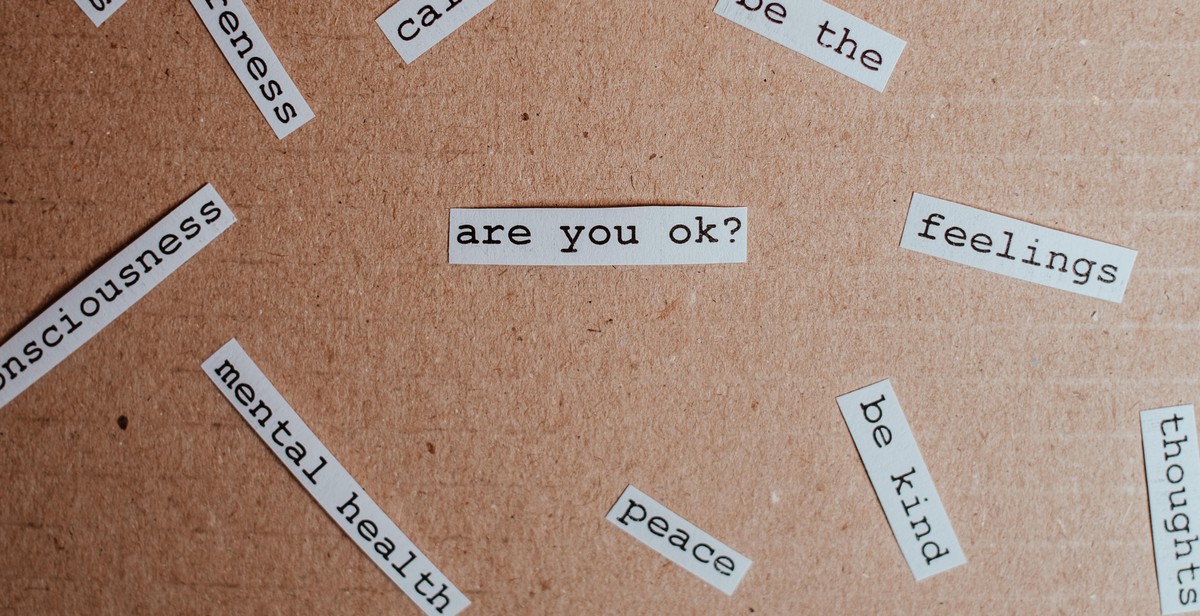
How to Pair Typography and Photography: Creating Visual Harmony in Design
Typography and photography are two essential elements of design that can make or break the visual appeal of any project. When used effectively, typography and photography can complement each other to create a cohesive and visually pleasing design. However, pairing these two elements can be a challenge for many designers.
Why Typography is Important in Design
Typography refers to the art and technique of arranging type to make written language legible, readable, and appealing when displayed. Typography is an essential aspect of design because it can convey a message, evoke emotions, and establish a brand identity. The right typography can make a significant impact on the overall visual appeal of a design.
Why Photography is Important in Design
Photography is another crucial element of design that can bring a design to life. Photography can evoke emotions, tell a story, and capture the essence of a brand. The right photograph can convey a message and create a memorable impression on the viewer. Photography can also add depth and texture to a design, making it visually appealing.
In this article, we will explore how to pair typography and photography to create visual harmony in design.
Understanding Typography
Typography is the art and technique of arranging type to make written language legible, readable, and appealing when displayed. It involves selecting typefaces, point sizes, line lengths, line-spacing, and letter-spacing, among other elements.
Typography Basics
When it comes to typography, there are a few basic concepts that designers must keep in mind. These include:
- Font: The specific style of lettering that is used, such as Arial or Times New Roman.
- Typeface: A collection of fonts that share a similar design, such as Helvetica or Garamond.
- Point size: The size of the font, measured in points.
- Line length: The width of a block of text, measured in characters or inches.
- Leading: The vertical space between lines of text.
- Kerning: The space between individual letters in a word.
Typography Styles and Their Impact
Typography styles refer to the various ways that designers can manipulate type to create different visual effects. These styles include:
- Serif: Typefaces that have small lines or flourishes at the ends of the strokes that make up each letter. Serif fonts are often used in print materials and are associated with tradition, elegance, and authority.
- Sans-serif: Typefaces that do not have serifs. Sans-serif fonts are often used in digital materials and are associated with modernity, simplicity, and clarity.
- Script: Typefaces that mimic handwriting. Script fonts are often used in invitations and other formal materials and are associated with elegance and sophistication.
- Display: Typefaces that are designed to stand out and make a bold statement. Display fonts are often used in headlines and advertisements and are associated with creativity and individuality.
Understanding typography basics and styles is essential for designers who want to create visually harmonious designs that pair typography and photography effectively. By selecting the right font, typeface, point size, line length, and style, designers can create designs that are both aesthetically pleasing and easy to read.
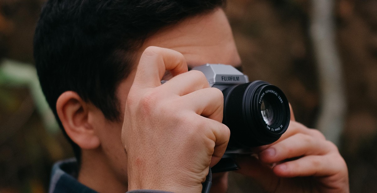
Understanding Photography
Photography is the art of capturing light and creating images that convey a message or tell a story. Understanding the basics of photography is crucial for designers who want to create visual harmony in their designs. Here are some essential photography basics:
Exposure
Exposure refers to the amount of light that enters the camera and hits the sensor. A well-exposed image has a balance of light and dark areas, and the subject is visible and clear. Exposure is controlled by three factors: aperture, shutter speed, and ISO.
Composition
Composition is the arrangement of elements in a photograph. A well-composed image is pleasing to the eye and draws the viewer’s attention to the subject. Composition rules, such as the rule of thirds and leading lines, can help designers create visually appealing designs.
Photography Styles and Their Impact
There are several photography styles, each with its own unique characteristics and impact on the viewer. Here are a few styles:
- Portrait Photography: Focuses on capturing the personality and expression of a person.
- Landscape Photography: Captures the beauty of nature, often showcasing vast landscapes and scenery.
- Street Photography: Captures candid moments of everyday life in public places.
- Product Photography: Showcases products in a way that enhances their features and benefits.
Designers can use these photography styles to create a specific mood or feeling in their designs. For example, landscape photography can create a sense of calm and relaxation, while street photography can create a sense of energy and excitement.
| Term | Definition |
|---|---|
| Exposure | The amount of light that enters the camera and hits the sensor. |
| Composition | The arrangement of elements in a photograph. |
| Aperture | The opening in the lens that controls the amount of light that enters the camera. |
| Shutter Speed | The amount of time the shutter is open, allowing light to enter the camera. |
| ISO | The sensitivity of the camera’s sensor to light. |
Why Pair Typography and Photography?
Typography and photography are two essential elements in graphic design. Both of these elements are powerful tools that can convey a message and evoke emotions. When used together, typography and photography can create a visual harmony that emphasizes the message and enhances the overall design.
Creating Visual Harmony
The combination of typography and photography can create a balanced and harmonious composition. The typography can complement the photograph by adding a layer of meaning, context, and visual interest. Likewise, the photograph can provide a visual reference that can reinforce the message of the typography.
One way to create visual harmony is to use typography that matches the style and mood of the photograph. For example, if the photograph has a vintage feel, using a retro font can enhance the overall look and feel of the design. Similarly, using a modern and sleek font can complement a minimalist photograph.
Emphasizing the Message
The use of typography and photography together can help emphasize the message of the design. Typography can be used to create hierarchy and guide the viewer’s attention to the most important information. Photographs can be used to add context and emotion to the message.
For example, a bold and attention-grabbing headline can be paired with a photograph that reinforces the message. This combination can create a powerful and memorable design that resonates with the viewer.
In conclusion, pairing typography and photography can create a visually appealing and effective design. By creating visual harmony and emphasizing the message, designers can create designs that are both beautiful and impactful.
Tips for Pairing Typography and Photography
Choosing the right typography
Typography plays a crucial role in creating visual harmony in design. When choosing typography, consider the mood and tone of the photograph. For example, if the photograph is playful and fun, choose a playful and fun font. Similarly, if the photograph is serious and professional, choose a font that conveys that same tone.
Another important factor to consider when choosing typography is legibility. Make sure the font is easy to read and doesn’t distract from the photograph. Avoid using overly decorative fonts that can be difficult to read and take away from the overall design.
Choosing the right photography
The right photograph can complement and enhance typography. When selecting photography, consider the overall design and message you want to convey. Choose photographs that have a similar mood and tone to the typography. For example, if the typography is bold and dramatic, choose a photograph that is also bold and dramatic.
It’s also important to consider the composition of the photograph. Look for photographs that have negative space or areas where the typography can be placed without obscuring important elements of the photograph.
Finding balance
The key to successful pairing of typography and photography is finding balance. The typography and photography should work together to create a cohesive design. Avoid using typography or photography that dominates the design, instead strive for a harmonious balance between the two elements.
Experiment with different font sizes, weights, and colors to find the perfect balance between typography and photography. Don’t be afraid to make adjustments as needed to achieve the desired result.
- Consider the mood and tone of the photograph when choosing typography
- Choose photographs that have a similar mood and tone to the typography
- Look for photographs with negative space for typography placement
- Avoid using typography or photography that dominates the design
- Experiment with font sizes, weights, and colors to find balance
| Tip | Description |
|---|---|
| Choosing the right typography | Consider the mood and tone of the photograph and choose a legible font that complements the design |
| Choosing the right photography | Select photographs with a similar mood and tone to the typography and with negative space for typography placement |
| Finding balance | Experiment with font sizes, weights, and colors to achieve a harmonious balance between typography and photography |
Examples of Visual Harmony in Design
Visual harmony is essential in creating a design that is pleasing to the eye. Here are some examples of how typography and photography can be paired to achieve visual harmony:
1. Contrast
Contrast is a powerful tool that can be used to create visual harmony. For example, using a bold sans-serif font with a delicate floral photograph can create an interesting contrast that draws the viewer’s attention.
2. Color
Color is another element that can be used to create visual harmony. For instance, using a monochromatic color scheme with a photograph that has similar hues can create a cohesive design.
3. Scale
Playing with scale can also create visual harmony in design. For example, using a large, bold font with a small, intricate photograph can create a balanced and visually appealing design.
4. Alignment
Alignment is a crucial element in creating visual harmony. For instance, aligning the text with the photograph can create a cohesive design that is easy to read and understand.
5. Negative Space
Negative space is the area around the elements in a design. Using negative space effectively can create visual harmony by giving the design breathing room. For example, using a large amount of negative space around the text and photograph can create a balanced design that is easy on the eyes.
| Technique | Example |
|---|---|
| Contrast |  |
| Color |  |
| Scale |  |
| Alignment |  |
| Negative Space |  |
Using these techniques and examples can help you create visually appealing designs that are harmonious and easy on the eyes.
Conclusion
Typography and photography are two crucial elements in design that can make or break the visual appeal of your project. When used correctly and harmoniously, they can create a powerful and engaging design that captures the attention of your audience and communicates your message effectively.
Tips for pairing typography and photography
- Choose typography and photography that complement each other in style, color, and theme.
- Avoid using too many fonts and stick to a maximum of 2-3 fonts to maintain visual harmony.
- Pay attention to the hierarchy of typography and use it to guide the viewer’s eye through the design.
- Experiment with different layouts and placements to find the perfect balance between typography and photography.
The importance of SEO optimization
While creating visually appealing designs is important, it is equally important to ensure that your content is SEO optimized. This means using keywords, meta descriptions, and alt tags for your images to improve your search engine rankings and increase your online visibility.
Final thoughts
Pairing typography and photography can be a challenging task, but with careful consideration and attention to detail, you can create a design that is both visually appealing and effective in communicating your message. Remember to keep it simple, experiment with different layouts, and optimize your content for SEO to maximize your impact and reach.