
How to Mix and Match Handwriting Fonts: Adding Personality and Charm to Your Designs
Handwriting fonts add a personal touch to any design. They are ideal for creating invitations, greeting cards, logos, and other creative projects. However, using a single handwriting font can make your design look monotonous and boring. This is where mixing and matching handwriting fonts comes in.
Why Mixing and Matching Handwriting Fonts is Important
Mixing and matching handwriting fonts adds personality and charm to your designs. It allows you to create unique designs that stand out from the crowd. Using multiple fonts also helps to break up the monotony of a design and make it more visually appealing.
Using a variety of handwriting fonts also helps to convey different emotions and moods. For example, a cursive font can add elegance and sophistication to a design, while a bold, playful font can add a sense of fun and excitement.
Benefits of Mixing and Matching Handwriting Fonts
- Creates unique and visually appealing designs
- Conveys different emotions and moods
- Adds personality and charm to your designs
- Breaks up the monotony of a design
- Allows for more creativity and experimentation
By mixing and matching handwriting fonts, you can take your design to the next level and create something truly unique and memorable. In the following sections, we will discuss some tips and best practices for mixing and matching handwriting fonts effectively.

Understanding Handwriting Fonts
Handwriting fonts are a popular choice for designers looking to add a personal touch to their designs. These fonts mimic the look of handwriting and can add a charming and unique element to any project. However, with so many different types of handwriting fonts available, it can be difficult to know where to start. In this section, we will explore the different types of handwriting fonts and how to choose the right one for your project.
Different Types of Handwriting Fonts
Handwriting fonts can be divided into two main categories: script and print. Script fonts mimic the look of cursive handwriting, while print fonts mimic the look of printed handwriting. Within these categories, there are many different styles to choose from, including:
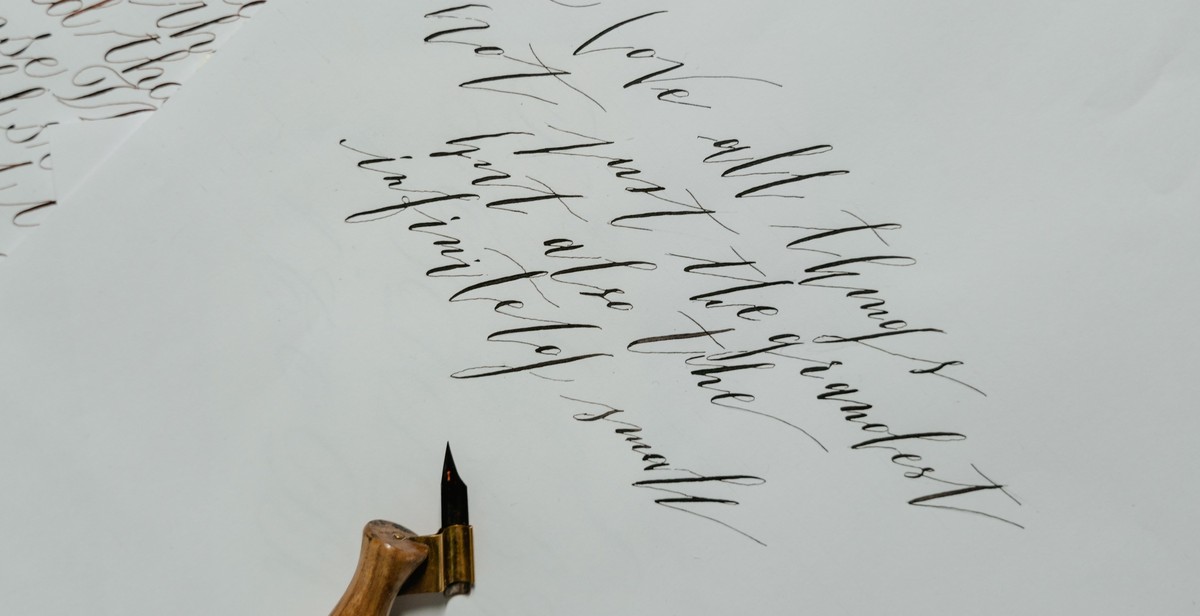
- Calligraphy: elegant and flowing, these fonts mimic the look of traditional calligraphy.
- Brush: these fonts mimic the look of brush lettering, with thick and thin strokes.
- Graffiti: these fonts mimic the look of street art and graffiti.
- Doodle: these fonts mimic the look of hand-drawn doodles and sketches.
Each type of handwriting font has its own unique style and personality. Choosing the right one for your project will depend on the overall look and feel you want to achieve.
How to Choose the Right Handwriting Font
When choosing a handwriting font, there are a few things to consider:
- Legibility: While handwriting fonts can add a personal touch to your designs, they can also be difficult to read if they are too ornate or stylized. Make sure the font you choose is easy to read.
- Style: Consider the overall style of your project. If you’re going for a romantic or elegant look, a calligraphy font might be a good choice. If you’re going for a more playful or casual look, a doodle font might be a better choice.
- Pairing: Handwriting fonts can be paired with other fonts to create a unique look. Consider pairing a handwriting font with a sans-serif or serif font for contrast.
Ultimately, the right handwriting font for your project will depend on your personal preferences and the overall look and feel you want to achieve. Experiment with different fonts and pairings to find the perfect combination for your design.

Mixing and Matching Handwriting Fonts
One of the best ways to add personality and charm to your designs is by mixing and matching handwriting fonts. However, it can be challenging to find fonts that complement each other and create a cohesive look. Here are some tips for choosing and using handwriting fonts in your designs:
Choosing Complementary Fonts
When choosing handwriting fonts, it’s essential to select fonts that complement each other. One way to do this is to choose fonts with similar styles or characteristics. For example, if you choose a cursive font with a lot of loops and swirls, you may want to pair it with a simpler, more straightforward font to balance it out.
Another way to choose complementary fonts is to select fonts with similar weights or thicknesses. For example, if you choose a thin, delicate font, you may want to pair it with another thin font to create a cohesive look.
Playing with Font Sizes and Weights
Playing with font sizes and weights is an excellent way to add depth and interest to your designs. For example, you can use a larger, bolder font for headlines and a smaller, thinner font for body text. You can also experiment with italicizing or bolding certain words or phrases to draw attention to them.
Using Fonts in Different Ways
Another way to mix and match handwriting fonts is to use them in different ways. For example, you can use one font for headlines and another for body text. You can also use fonts for different elements, such as using a handwritten font for a logo or a call-to-action button.
Finally, you can also experiment with different color combinations to create a unique look. For example, you can use a light-colored font on a dark background or vice versa.
| Font 1 | Font 2 |
|---|---|
| Brush Script MT | Helvetica |
| Snell Roundhand | Georgia |
| Lucida Handwriting | Verdana |
Conclusion
By mixing and matching handwriting fonts, you can add personality and charm to your designs. Remember to choose complementary fonts, play with font sizes and weights, and use fonts in different ways. With these tips, you can create a cohesive and unique look that will make your designs stand out.
Tips for Mixing and Matching Handwriting Fonts
Mixing and matching handwriting fonts can add a touch of personality and charm to your designs. However, it can be tricky to get the right balance. Here are some tips to help you create a harmonious and visually appealing design:
Start with a Strong Base Font
When mixing and matching handwriting fonts, it’s important to start with a strong base font. This will provide a solid foundation for your design and help you choose complementary fonts. A good base font should be easy to read and versatile, so it can be paired with a variety of handwriting fonts. Some popular base fonts include Arial, Times New Roman, and Helvetica.
Stick to a Color Palette
Using a consistent color palette can help tie your design together and make it more visually appealing. When mixing and matching handwriting fonts, it’s important to choose colors that complement each other. Stick to a palette of two or three colors to avoid overwhelming your design.
Use Fonts in Moderation
While it can be tempting to use a variety of handwriting fonts, it’s important to use them in moderation. Too many fonts can make your design look cluttered and chaotic. Stick to two or three handwriting fonts and use them strategically to highlight important information or add emphasis.
Avoid Clichés
When mixing and matching handwriting fonts, it’s important to avoid clichés. This means avoiding overused fonts or font combinations that have become too common. Instead, try to be creative and experiment with different combinations to find something unique and visually appealing.
| DO | DON’T |
|---|---|
| Pair a bold, brush script font with a simple sans-serif font for a modern look | Use too many handwriting fonts in one design |
| Pair a delicate calligraphy font with a bold serif font for an elegant look | Use clichéd font combinations, such as Comic Sans and Papyrus |
| Use a handwritten font for headings or titles to add personality to your design | Use hard-to-read handwriting fonts for body text |
By following these tips, you can create a visually appealing design that showcases your creativity and personality. Remember to start with a strong base font, stick to a color palette, use fonts in moderation, and avoid clichés.

Conclusion
Handwriting fonts can add a touch of personality and charm to your designs, and mixing and matching them can create a unique and visually appealing result. By following the tips and techniques outlined in this article, you can confidently experiment with different fonts and create designs that stand out.
Choose Fonts That Complement Each Other
When mixing and matching handwriting fonts, it’s important to choose fonts that complement each other. Consider the style, weight, and overall feel of each font to ensure they work well together.
Experiment with Different Pairings
Don’t be afraid to experiment with different pairings of handwriting fonts. Try combining different styles, such as a bold font with a more delicate one, or a script font with a handwritten one.
Consider the Purpose of Your Design
The purpose of your design should also be taken into consideration when mixing and matching handwriting fonts. For example, a more formal design may require a more traditional font pairing, while a playful design may benefit from a more whimsical pairing.
Final Thoughts
Mixing and matching handwriting fonts can be a fun and creative way to add personality and charm to your designs. Remember to choose fonts that complement each other, experiment with different pairings, and consider the purpose of your design. With these tips in mind, you’ll be able to create unique and visually appealing designs that stand out.