
How to Create a Typographic Poster: Designing Visual Impact with Text
Typographic posters are a popular form of graphic design that uses typography as the main element of the design. These posters are designed to communicate a message or promote an event, product, or service. The typography in a typographic poster is not just a means of conveying information, but also a design element that can be used to create visual impact and evoke emotions in the viewer.
What is a Typographic Poster?
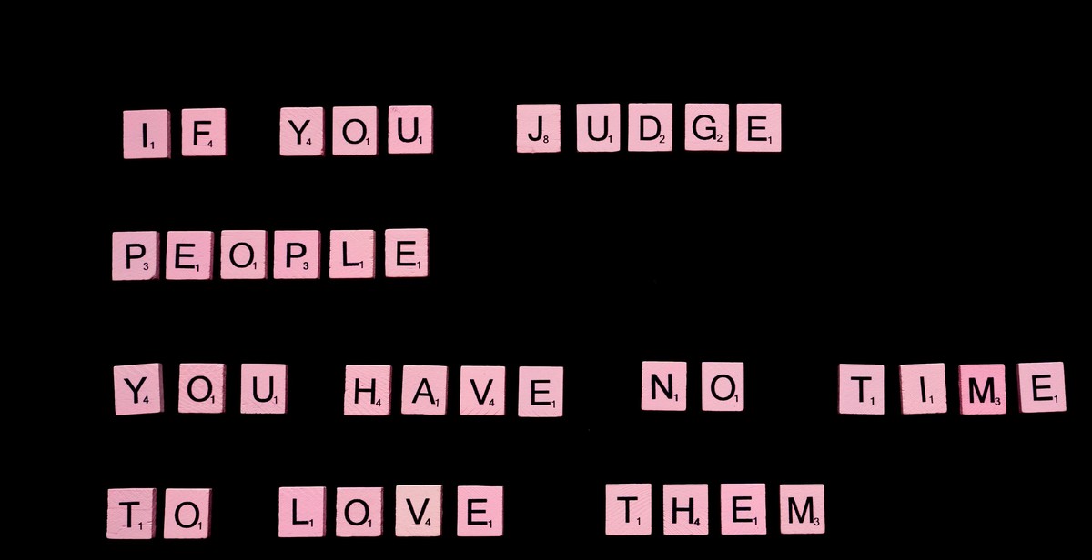
A typographic poster is a design that uses typography as the main design element. The text is arranged in a way that creates a visual impact and communicates a message to the viewer. These posters can be created for a variety of purposes including advertising, promoting an event, or simply as a piece of art.
Typographic posters can be created using a variety of techniques including hand-drawn lettering, digital typography, and a combination of both. The design process for a typographic poster involves selecting the right fonts, arranging the text in a visually appealing way, and choosing colors that complement the overall design.
Why Create a Typographic Poster?
Typographic posters are a great way to communicate a message in a visually appealing way. They can be used to promote an event or product, or simply as a piece of art. The typography in a typographic poster can be used to create a visual impact and evoke emotions in the viewer, making it a powerful tool for communication.
Creating a typographic poster can also be a fun and rewarding creative project. It allows designers to experiment with typography and design, and create something that is both visually appealing and meaningful.
Step 1: Define Your Message
Before you start designing your typographic poster, it’s important to identify the message you want to convey. Your message should be clear and concise, and it should resonate with your target audience. Think about what you want people to feel or think when they see your poster.
Identifying Your Message
Start by brainstorming keywords that relate to your message. These keywords can be emotions, concepts, or even specific words or phrases. Once you have a list of keywords, try to distill them down into a single sentence or phrase that captures the essence of your message.
For example, if you’re designing a poster for a music festival, your message might be “Join the party and experience the best music of the summer.” This message captures the excitement and fun of the festival while also highlighting its main selling point: the music.
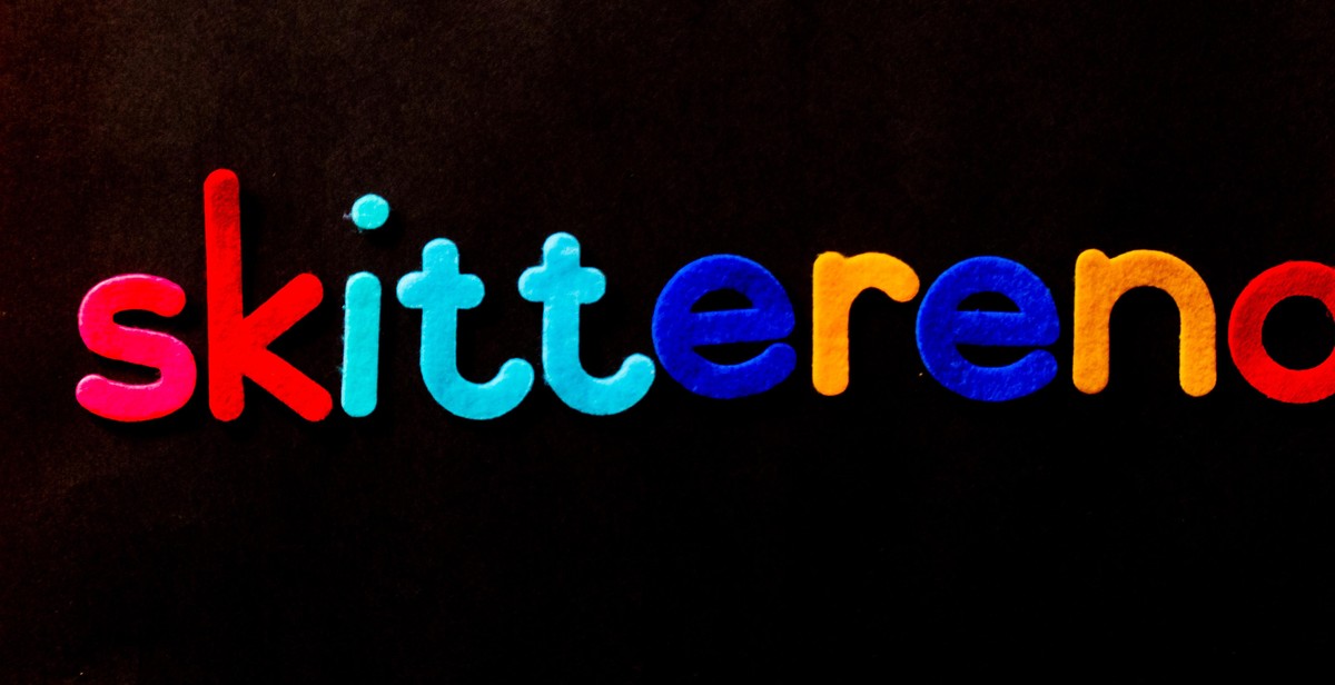
Choosing the Right Font
The font you choose for your poster can have a big impact on how your message is received. Different fonts convey different emotions and moods, so it’s important to choose one that aligns with your message.
For example, if your message is playful and fun, you might choose a bold, rounded font like Comic Sans or Poppins. If your message is more serious and sophisticated, a thin, elegant font like Helvetica or Garamond might be more appropriate.
When choosing your font, also consider its legibility. Make sure it’s easy to read from a distance and that it stands out against your background. Avoid using too many different fonts or styles, as this can make your poster look cluttered and confusing.
- Identify your message using keywords
- Distill your message down into a single sentence or phrase
- Choose a font that aligns with your message and is easy to read
| Do | Don’t |
|---|---|
| Choose a font that aligns with your message | Use too many different fonts or styles |
| Make sure your font is easy to read from a distance | Choose a font that’s too difficult to read |
| Avoid cluttering your poster with too much text | Use a font that doesn’t align with your message |
Step 2: Choose Your Color Scheme
Color is an essential aspect of any design. It can convey emotions, set the mood, and affect the overall impact of your typographic poster. When choosing a color scheme for your poster, consider color psychology and color combinations.
Color Psychology
Color psychology is the study of how colors affect human behavior and emotions. Understanding color psychology can help you choose the right color scheme for your typographic poster.
For example, red is often associated with passion and energy, while blue is associated with calmness and trust. Yellow is associated with happiness and optimism, while green is associated with growth and nature. Black is associated with sophistication and elegance, while white is associated with purity and simplicity.
Color Combinations
Choosing the right color combination is crucial for creating a visually appealing typographic poster. There are several color combinations to choose from, including complementary, analogous, triadic, and monochromatic.
- Complementary colors are opposite each other on the color wheel, such as red and green or blue and orange. They create a high contrast and are perfect for creating a bold and impactful design.
- Analogous colors are next to each other on the color wheel, such as blue, blue-green, and green. They create a harmonious and calming effect.
- Triadic colors are evenly spaced on the color wheel, such as red, yellow, and blue. They create a vibrant and balanced design.
- Monochromatic colors are variations of the same color, such as light blue, medium blue, and dark blue. They create a subtle and sophisticated design.
Consider experimenting with different color combinations to find the one that best suits your typographic poster’s message and mood.
| Color Combination | Example |
|---|---|
| Complementary | Red and Green |
| Analogous | Blue, Blue-Green, and Green |
| Triadic | Red, Yellow, and Blue |
| Monochromatic | Light Blue, Medium Blue, and Dark Blue |

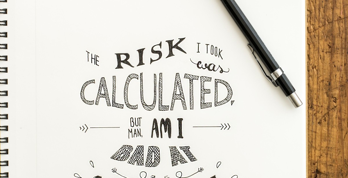
Step 3: Layout and Composition
Once you have selected the typeface and have a clear vision of the message you want to convey, it is time to focus on the layout and composition of your typographic poster. A well-designed layout can help emphasize your message and create a visual hierarchy that guides the viewer’s eye.
Hierarchy and Contrast
One of the most important aspects of creating a typographic poster is establishing a hierarchy of information. This can be achieved through the use of contrast, which can be created through differences in font size, weight, color, and spacing. By making certain words or phrases stand out, you can guide the viewer’s eye and emphasize the most important information.
When choosing fonts for your poster, it is important to consider how they will work together. Select fonts that complement each other and create a cohesive look. Avoid using too many different fonts, as this can create a cluttered and confusing design.
Alignment and Spacing
Another important aspect of layout and composition is alignment and spacing. Proper alignment can help create a sense of order and structure in your design, while spacing can help improve readability and make your poster more visually appealing.
When aligning your text, consider using a grid system to ensure everything is properly aligned. This can help create a consistent and professional-looking design. Additionally, pay attention to the spacing between your letters, words, and lines. Adjusting the spacing can help improve readability and create a more balanced design.
| Before | After |
|---|---|
 |
 |
By paying attention to hierarchy, contrast, alignment, and spacing, you can create a visually impactful typographic poster that effectively conveys your message.
Step 4: Adding Visual Elements
While typography is the main focus of a typographic poster, adding visual elements can help enhance the overall impact of the design. In this step, we will explore two types of visual elements that can be added to a typographic poster: illustrations and icons, and textures and patterns.
Illustrations and Icons
Illustrations and icons can add a visual narrative to a typographic poster. They can also break up the text and create a more dynamic composition. When choosing illustrations and icons, consider the overall theme and message of the poster. Select images that complement the typography and add to the overall impact of the design.
- Choose illustrations and icons that are simple and easy to understand.
- Ensure that the illustrations and icons are of high quality and resolution.
- Consider the placement of the illustrations and icons. They should not detract from the typography but rather enhance it.
Texture and Patterns
Texture and patterns can add depth and interest to a typographic poster. They can also create a tactile feel and add a sense of dimensionality to the design. When using textures and patterns, consider the overall mood and tone of the poster. Select textures and patterns that complement the typography and add to the overall impact of the design.
- Choose textures and patterns that are subtle and do not detract from the typography.
- Ensure that the textures and patterns are of high quality and resolution.
- Consider the placement of the textures and patterns. They should not overwhelm the typography but rather enhance it.
| Illustrations and Icons | Texture and Patterns |
|---|---|
 |
 |
 |
Step 5: Final Touches and Exporting
Once you have created your typographic poster, it’s important to review and make any necessary adjustments to ensure it’s perfect. Here are some final touches to consider:
Review and Adjustments
- Check for any typos or spelling errors
- Review the typography to make sure it’s legible and easy to read
- Adjust the spacing between letters and lines to improve readability
- Make sure the contrast between the text and background is appropriate
- Review the overall design to ensure it’s visually appealing and impactful
Once you have made any necessary adjustments, it’s time to export your poster for print or web.
Exporting for Print
When exporting for print, it’s important to consider the following:
- Export your design as a high-resolution PDF or EPS file
- Set the color mode to CMYK
- Include any necessary bleed and crop marks
- Make sure the file is in the correct size and resolution for printing
Exporting for Web
When exporting for web, it’s important to consider the following:
- Export your design as a high-quality JPEG, PNG or GIF file
- Optimize the file size for faster loading times
- Make sure the file is in the correct size and resolution for web use
- Consider creating multiple versions of your poster in different sizes for different platforms, such as social media
By following these final touches and exporting guidelines, you can ensure your typographic poster looks its best and is ready for print or web use.
Conclusion
Creating a typographic poster is a great way to showcase your creativity and design skills. With the right tools and techniques, you can create a visually stunning poster that will grab the attention of your target audience.
Key Takeaways
- Choose a strong message or quote to feature on your poster.
- Experiment with different font styles, sizes, and colors to create visual interest.
- Use contrast and hierarchy to guide the viewer’s eye and emphasize important information.
- Consider the overall layout and composition of the poster, including the use of negative space.
- Test your design on different devices and at different sizes to ensure readability and impact.
By following these tips and best practices, you can create a typographic poster that effectively communicates your message and captures the attention of your audience. Remember to keep experimenting, learning, and refining your skills to continue producing high-quality designs.
Ready to get started?
Try applying these techniques to your next design project and see the impact it can have. With practice and patience, you can become a skilled typographic poster designer and create stunning visuals that leave a lasting impression.