
Introduction: How to Use Typography in Branding
Creating a consistent and memorable visual identity is crucial in establishing a brand that stands out in today’s competitive market. One of the most important elements of a brand’s visual identity is typography. Typography refers to the style, size, and arrangement of typefaces used in design and communication.
Why Typography is Important in Branding
The typography used in a brand’s logo, website, packaging, and marketing materials can significantly impact how the brand is perceived by its target audience. Typography helps to convey the brand’s personality, values, and tone of voice. It can also evoke emotions and create a sense of familiarity and trust with consumers.
Using consistent typography across all brand assets helps to establish a strong visual identity that is easily recognizable and memorable. Consistency in typography also creates a sense of professionalism and attention to detail, which can enhance the credibility and trustworthiness of the brand.
However, using typography effectively in branding requires more than just choosing a few fonts and using them consistently. It requires an understanding of typography principles, as well as the ability to use typography creatively to communicate the brand’s message effectively.
In this article, we will explore how to use typography in branding to create a consistent and memorable visual identity that effectively communicates your brand’s message and values to your target audience.

Choosing the Right Typeface
Typography plays a crucial role in creating a consistent and memorable visual identity for your brand. Choosing the right typeface can help communicate your brand’s personality and values effectively. Here are some tips on how to choose the right typeface for your brand:
Understanding Typeface Categories
Before you start choosing a typeface for your brand, it’s important to understand the different typeface categories. There are four main categories:
- Serif: Serif typefaces have small lines or flourishes at the ends of the strokes. They are traditional and classic, and are often used in print media.
- Sans-serif: Sans-serif typefaces do not have the small lines or flourishes at the ends of the strokes. They are modern and clean, and are often used in digital media.
- Script: Script typefaces look like handwriting or calligraphy. They are elegant and sophisticated, and are often used for luxury brands.
- Display: Display typefaces are decorative and attention-grabbing. They are often used for headlines or logos.
Matching Typefaces to Brand Personality
Once you understand the different typeface categories, you can start matching them to your brand’s personality. Your brand’s personality should be reflected in your typeface choice. For example:
| Brand Personality | Ideal Typeface |
|---|---|
| Traditional | Serif |
| Modern | Sans-serif |
| Elegant | Script |
| Playful | Display |
It’s also important to consider the legibility and readability of your typeface. Your brand’s message should be easy to read and understand. Avoid using overly decorative or complicated typefaces that may be difficult to read.
By understanding the different typeface categories and matching them to your brand’s personality, you can choose the right typeface that effectively communicates your brand’s values and message.

Creating a Hierarchy
When it comes to typography in branding, creating a hierarchy is essential for establishing a consistent and memorable visual identity. A hierarchy helps guide the viewer’s eye through the design, emphasizing the most important information and creating a sense of order.
Using Size and Weight to Establish Hierarchy
One of the most effective ways to establish a hierarchy is through the use of size and weight. Typically, larger and bolder text will catch the viewer’s attention first, while smaller and lighter text will be perceived as less important.
When choosing font sizes and weights, consider the overall layout and the content hierarchy. Important information, such as the brand name or tagline, should be larger and bolder than secondary information, such as a product description or contact information.
It’s important to note that too many font sizes and weights can create a cluttered and confusing design. Stick to a few key sizes and weights to create a clear and effective hierarchy.
Using Color and Contrast to Enhance Hierarchy
Color and contrast can also be used to enhance hierarchy in typography. By using contrasting colors, such as black and white, or complementary colors, you can create a visual hierarchy that guides the viewer’s eye through the design.
Color can also be used to highlight important information. For example, using a bold or bright color for the brand name can help it stand out and reinforce brand recognition.
When using color and contrast, it’s important to consider accessibility. Make sure there is enough contrast between text and background colors to ensure readability for all viewers.
| Tip: | Use a color palette that complements your brand’s personality and values. Consistent use of color will help reinforce brand recognition and create a cohesive visual identity. |
|---|
Consistency is Key
When it comes to creating a memorable visual identity for your brand, consistency is key. From the colors you use to the typography you choose, every element of your branding should be consistent across all channels. This is where a style guide comes in handy.
Creating a Style Guide
A style guide is a document that outlines the specific rules and guidelines for your brand’s visual identity. It should include everything from your brand’s color palette to the typography you use. By creating a style guide, you can ensure that everyone on your team is on the same page when it comes to branding.
Your style guide should include:
- Your brand’s color palette
- Typography guidelines, including font choices, sizes, and weights
- Logo usage guidelines, including size, placement, and color variations
- Image guidelines, including style and usage
- Social media guidelines, including profile picture and cover photo specifications
Using Consistent Typography Across All Channels
Typography is a crucial element of your brand’s visual identity. It sets the tone for your brand and can help you stand out from your competitors. By using consistent typography across all channels, you can create a cohesive and memorable brand image.
When choosing typography for your brand, consider:
- The typeface – choose a typeface that reflects your brand’s personality and values
- The font size – use consistent font sizes across all channels
- The font weight – use consistent font weights across all channels
By using consistent typography, you can create a strong and memorable brand image that will stick in the minds of your customers.
| Benefits of Consistent Typography |
|---|
| Creates a cohesive brand image |
| Helps your brand stand out from competitors |
| Makes your brand more memorable |
Overall, consistency is key when it comes to creating a memorable visual identity for your brand. By creating a style guide and using consistent typography across all channels, you can ensure that your brand is easily recognizable and memorable to your customers.
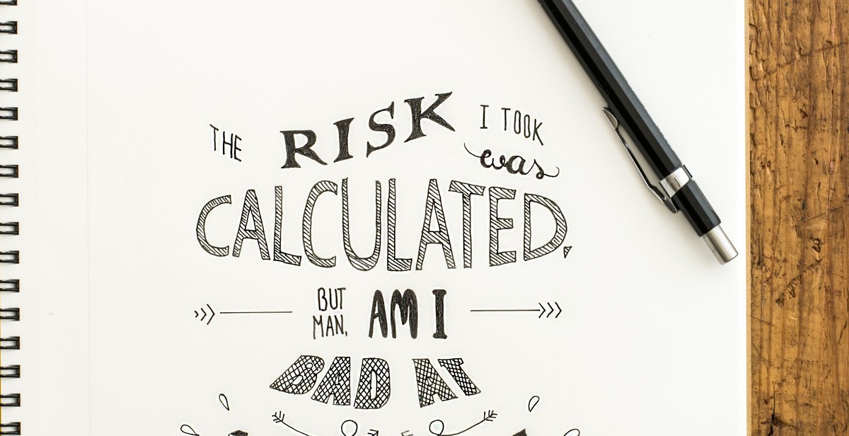
Making it Memorable
When it comes to branding, it’s essential to stand out from the competition. Adding unique touches to your typography can help you achieve this. This can include customizing lettering or incorporating unique symbols or icons.
Customizing lettering can help create a unique and recognizable brand identity. This can involve tweaking existing fonts or creating a custom font from scratch. By doing so, your brand can have a one-of-a-kind look that sets it apart from others in the market.
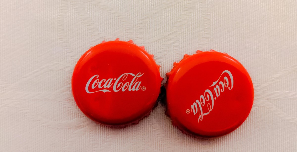
Another way to add a unique touch to your typography is by incorporating unique symbols or icons. These can be used to represent your brand or convey a specific message. For example, Nike’s iconic swoosh logo is a simple yet memorable symbol that represents the brand’s commitment to athleticism and movement.
Using Typography to Evoke Emotion
Typography can also be used to evoke emotion and create a connection with your audience. By choosing the right font, style, and color, you can create a visual identity that resonates with your target market.
For example, serif fonts are often associated with tradition, elegance, and sophistication. This makes them a popular choice for luxury brands, such as Rolex or Chanel. On the other hand, sans-serif fonts are often associated with modernity, simplicity, and clarity. This makes them a popular choice for tech companies, such as Apple or Google.
Color can also play a significant role in evoking emotion through typography. For example, red is often associated with passion, excitement, and urgency, while blue is associated with trust, reliability, and calmness. By choosing the right color palette for your typography, you can create a visual identity that resonates with your audience.
Overall, typography is a powerful tool for creating a consistent and memorable visual identity for your brand. By adding unique touches and using typography to evoke emotion, you can create a brand identity that stands out from the competition and resonates with your target market.

Conclusion
Typography is an essential element in branding, and it has a significant impact on how a brand is perceived by its audience. The right typography can create a consistent and memorable visual identity that sets a brand apart from its competitors. Typography can convey a brand’s personality, values, and message, and it can influence how people feel about a brand.
In this article, we have discussed the importance of typography in branding and how it can be used to create a consistent and memorable visual identity. We have also looked at some best practices for using typography in branding, including choosing the right font, using typography to convey a brand’s personality and values, and creating a typographic hierarchy.
By following these best practices, businesses can effectively use typography to create a visual identity that resonates with their target audience and helps them stand out in a crowded marketplace.
- Choose a font that reflects your brand’s personality and values
- Create a typographic hierarchy to guide the reader’s eye
- Use typography consistently across all brand materials
- Experiment with typography to create a unique visual identity
Overall, typography is a powerful tool in branding, and businesses should take the time to carefully consider their typography choices to create a consistent and memorable visual identity that resonates with their target audience.