
How to Use Color Theory in Interior Design: Creating Harmonious Color Schemes
Color is an essential element in interior design, and it can make or break the overall look and feel of a room. Understanding the principles of color theory can help you create a harmonious color scheme that enhances the beauty of your space.
The Basics of Color Theory
Color theory is the study of how colors interact with each other. It involves understanding the color wheel, which is a visual representation of the primary, secondary, and tertiary colors. The color wheel helps designers choose colors that work well together.
There are three primary colors: red, yellow, and blue. When combined, they create secondary colors: orange, green, and purple. Tertiary colors are created by mixing primary and secondary colors.
Creating a Harmonious Color Scheme
One of the most important aspects of color theory in interior design is creating a harmonious color scheme. A harmonious color scheme uses colors that are next to each other on the color wheel, such as blue and green or red and orange. This creates a sense of unity and balance in the room.
Another way to create a harmonious color scheme is by using complementary colors, which are opposite each other on the color wheel, such as blue and orange or red and green. This creates a bold and dynamic look.
Understanding color theory can help you create a beautiful and cohesive color scheme that elevates the design of your space. Whether you want a calming and soothing atmosphere or a vibrant and energetic one, color theory can help you achieve your desired effect.
Understanding Color Theory
Color theory is the study of how colors interact with each other. It is an essential concept in interior design as it helps to create harmonious color schemes that are pleasing to the eye. Understanding color theory is crucial to selecting the right colors for an interior design project.
Primary, Secondary, and Tertiary Colors
The color wheel is the basis of color theory. The wheel is made up of three primary colors, three secondary colors, and six tertiary colors. Primary colors are red, blue, and yellow. Secondary colors are created by mixing two primary colors together, resulting in purple, green, and orange. Tertiary colors are created by mixing a primary color with a secondary color, resulting in colors such as red-orange, yellow-green, and blue-purple.
Color Wheel
The color wheel is a visual representation of the relationships between colors. It is used to create harmonious color schemes that are pleasing to the eye. The color wheel is divided into warm and cool colors. Warm colors include red, orange, and yellow, while cool colors include blue, green, and purple. The wheel is also divided into complementary colors, which are opposite each other on the wheel. Complementary colors include red and green, blue and orange, and yellow and purple. When used together, complementary colors create a high contrast and vibrant effect.
Color Harmony
Color harmony is the use of color combinations that are pleasing to the eye. There are several types of color harmony, including monochromatic, analogous, triadic, and tetradic. Monochromatic color harmony uses different shades and tints of a single color. Analogous color harmony uses colors that are next to each other on the color wheel, such as blue and green. Triadic color harmony uses three colors that are evenly spaced on the color wheel, such as red, yellow, and blue. Tetradic color harmony uses four colors that are two sets of complementary colors, such as red and green, and blue and orange.
| Color Harmony | Colors Used |
|---|---|
| Monochromatic | Various shades and tints of a single color |
| Analogous | Colors that are next to each other on the color wheel |
| Triadic | Three colors that are evenly spaced on the color wheel |
| Tetradic | Four colors that are two sets of complementary colors |
Understanding color theory is essential to creating harmonious color schemes in interior design. By using the color wheel and different color harmonies, designers can create a visually appealing space that is both functional and beautiful.
Applying Color Theory in Interior Design
Color theory is an important aspect of interior design. When used effectively, it can create a harmonious and visually appealing space. There are several color schemes that interior designers use to achieve this effect.
Monochromatic Color Scheme
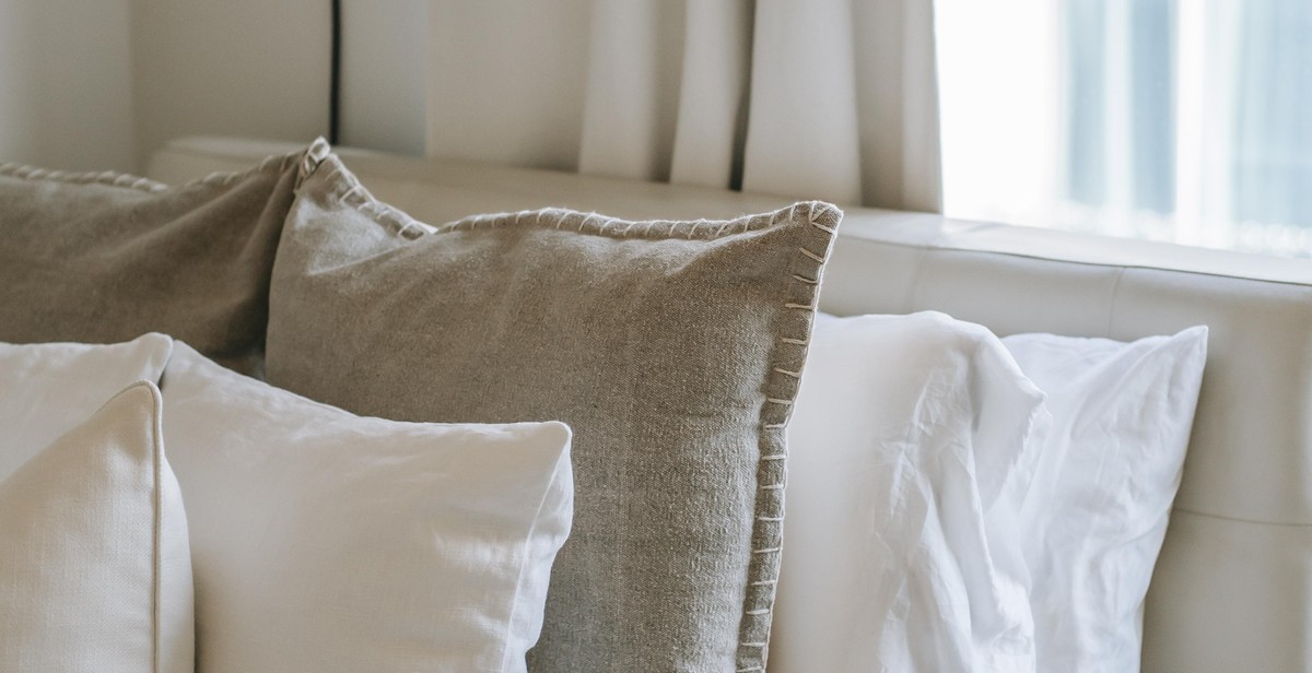
A monochromatic color scheme involves using different shades and tints of one color. This creates a cohesive and calming effect in a room. When using a monochromatic color scheme, it’s important to incorporate different textures and patterns to add interest and depth to the space.
Analogous Color Scheme
An analogous color scheme involves using colors that are next to each other on the color wheel. For example, yellow, green, and blue. This color scheme creates a sense of harmony and balance in a room. When using an analogous color scheme, it’s important to choose one dominant color and use the others as accents.
Complementary Color Scheme
A complementary color scheme involves using colors that are opposite each other on the color wheel. For example, blue and orange. This color scheme creates a bold and vibrant effect in a room. When using a complementary color scheme, it’s important to balance the colors with neutrals and use them in moderation.
Triadic Color Scheme
A triadic color scheme involves using three colors that are equally spaced on the color wheel. For example, red, yellow, and blue. This color scheme creates a dynamic and energetic effect in a room. When using a triadic color scheme, it’s important to choose one dominant color and use the others as accents.
Overall, applying color theory in interior design can transform a space from ordinary to extraordinary. By using the different color schemes and incorporating texture and patterns, you can create a harmonious and visually appealing environment.
Choosing the Right Colors
When it comes to interior design, choosing the right colors can make or break a room. Color theory is a powerful tool that can help you create harmonious color schemes that complement the mood and purpose of the room. Here are some tips for choosing the right colors:
Consider the Mood and Purpose of the Room
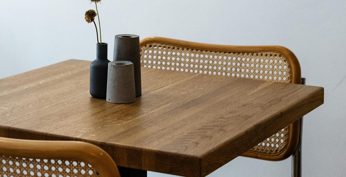
The first step in choosing the right colors is to consider the mood and purpose of the room. For example, if you want to create a relaxing atmosphere in a bedroom, you might choose soft, muted colors like blue or green. On the other hand, if you want to create a vibrant and energetic atmosphere in a living room, you might choose bold, bright colors like red or orange. By considering the mood and purpose of the room, you can choose colors that will enhance the overall feel of the space.
Take into Account the Natural Light
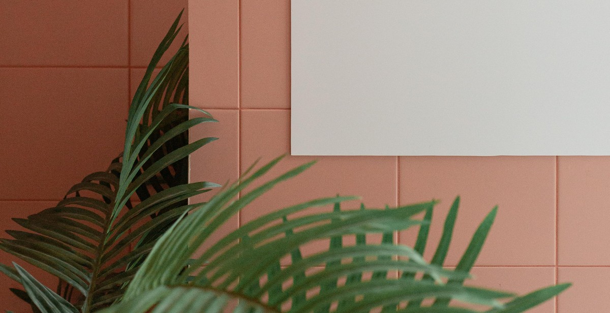
The natural light in a room can have a big impact on how colors appear. For example, a room with lots of natural light might make colors appear brighter and more vibrant. On the other hand, a room with limited natural light might make colors appear duller and more muted. When choosing colors, it’s important to take into account the natural light in the room. You might want to experiment with different colors and see how they look in different lighting conditions.
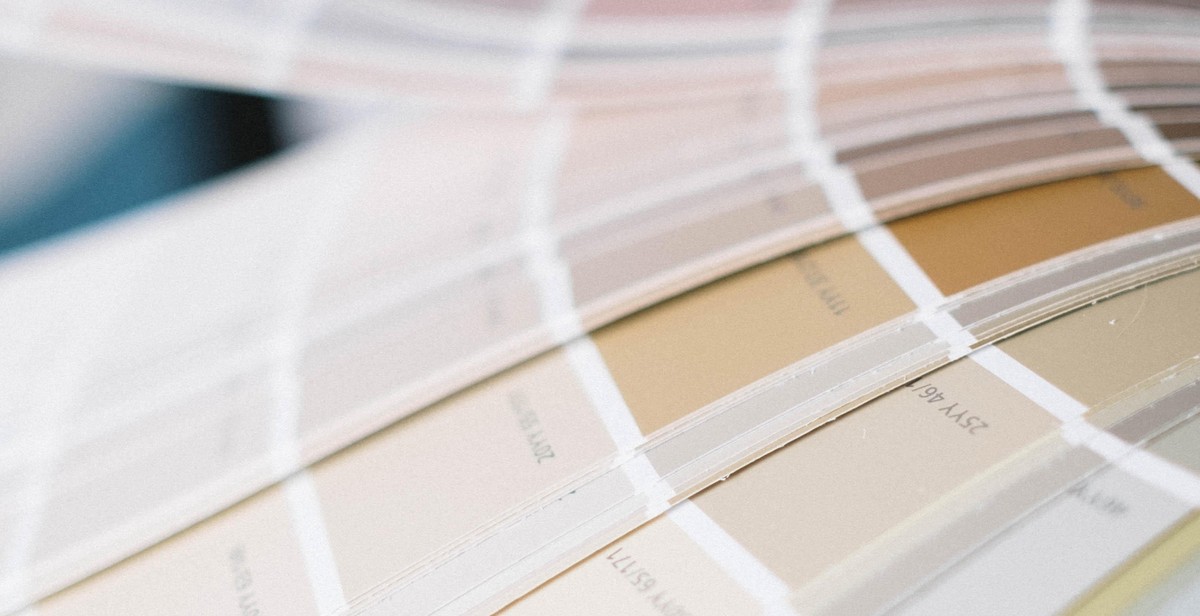
Experiment with Swatches and Samples
Before committing to a color scheme, it’s a good idea to experiment with swatches and samples. This will give you a better idea of how different colors will look in the room. You can test different colors by painting small sections of the wall or by using fabric swatches. By experimenting with different colors, you can find the perfect color scheme that will enhance the mood and purpose of the room.
In conclusion, choosing the right colors is an important part of interior design. By considering the mood and purpose of the room, taking into account the natural light, and experimenting with swatches and samples, you can create a harmonious color scheme that will enhance the overall feel of the space.
Conclusion
In conclusion, color theory is an essential aspect of interior design that can help bring harmony, balance, and cohesion to any space. Understanding the basics of color theory and how to apply it can help you create a space that not only looks beautiful but also feels comfortable and welcoming.
Tips for Using Color Theory in Interior Design
- Start with a color wheel to identify complementary and analogous colors
- Consider the mood and atmosphere you want to create in a space
- Use neutral colors as a base and add pops of color for interest
- Experiment with different shades, tones, and hues of a color to create depth and dimension
- Don’t be afraid to mix and match colors to create a unique and personalized space
The Importance of SEO in Interior Design Writing
As an interior design writer, it is important to not only create engaging and informative content but also to optimize it for search engines. By incorporating keywords and phrases related to color theory and interior design, you can improve the visibility of your content and attract more readers to your website or blog.
| Keyword | Search Volume | Competition |
|---|---|---|
| Color theory | 1,600 | Low |
| Interior design | 33,100 | High |
| Color schemes | 1,000 | Low |
By incorporating these keywords and phrases into your content, you can improve your search engine rankings and attract more traffic to your website or blog.