
How to Use Color Psychology in Design: Creating Emotional Impact and Visual Harmony
Color psychology is the study of how colors affect human behavior, emotions, and moods. It is an essential aspect of design that can create emotional impact and visual harmony. This article will discuss why color psychology is important in design and how to use it effectively to create a successful design.
Why Color Psychology is Important in Design
Colors can evoke emotions, feelings, and thoughts. They can influence behavior, perception, and decision-making. In design, colors can help communicate a message, establish a brand identity, and create a visual hierarchy. Understanding color psychology can help designers make informed decisions about color choices and create designs that resonate with their target audience.
Color psychology also plays a significant role in marketing and advertising. Brands use colors to attract attention, create brand recognition, and influence purchasing decisions. For example, red is often used to represent excitement, passion, and urgency, while blue is associated with trust, reliability, and calmness.
How to Use Color Psychology in Design
To use color psychology effectively in design, it is essential to understand the meanings and associations of different colors. Here are some tips:
- Choose colors that align with the brand’s personality and values.
- Consider the target audience and their preferences.
- Use color combinations that create visual harmony and balance.
- Avoid using too many colors, as it can be overwhelming and confusing.
- Use color to highlight important information and create a visual hierarchy.
By applying these tips and understanding the importance of color psychology in design, designers can create designs that are not only aesthetically pleasing but also emotionally impactful and effective.
Understanding Color Psychology
Color psychology is the study of how colors affect human behavior and emotions. As a designer, understanding color psychology is crucial in creating designs that evoke the desired emotional response from your audience.
The Basics of Color Theory
Color theory is the science behind how colors are created, mixed, and used in design. It is based on three primary colors – red, yellow, and blue – and the secondary colors that are created by mixing them. These secondary colors are green, orange, and purple.
Color theory also involves understanding the color wheel, which is a visual representation of the relationships between colors. The color wheel is divided into warm colors – such as red, orange, and yellow – and cool colors – such as blue, green, and purple. Warm colors are associated with energy, excitement, and passion, while cool colors are associated with calmness, relaxation, and tranquility.
The Meanings Behind Colors
Colors have different meanings and can evoke different emotions and moods. Here are some common meanings behind colors:
- Red – associated with passion, love, and excitement. It can also be associated with danger and anger.
- Orange – associated with energy, warmth, and enthusiasm. It can also be associated with caution and warning.
- Yellow – associated with happiness, optimism, and warmth. It can also be associated with cowardice and caution.
- Green – associated with nature, growth, and harmony. It can also be associated with envy and greed.
- Blue – associated with calmness, trust, and security. It can also be associated with sadness and depression.
- Purple – associated with luxury, royalty, and sophistication. It can also be associated with mystery and sadness.
Understanding the meanings behind colors is important in choosing the right color palette for your design. For example, if you want to create a calming and soothing design, you might choose shades of blue. If you want to create a passionate and energetic design, you might choose shades of red or orange.
| Color | Meaning |
|---|---|
| Red | Passion, love, excitement |
| Orange | Energy, warmth, enthusiasm |
| Yellow | Happiness, optimism, warmth |
| Green | Nature, growth, harmony |
| Blue | Calmness, trust, security |
| Purple | Luxury, royalty, sophistication |
Overall, understanding color psychology is an essential part of creating effective designs. By using the right colors, you can create emotional impact and visual harmony that will resonate with your audience and evoke the desired response.

Using Color Psychology in Design
Colors have a significant impact on the human mind and can evoke different emotions and feelings. As a designer, it is essential to use color psychology to create emotional impact and visual harmony in your designs. In this section, we will explore how to choose colors for emotional impact, create visual harmony with colors, and use contrast and complementary colors.
Choosing Colors for Emotional Impact
Colors can evoke different emotions and feelings in people. For example, red can signify passion, love, or danger, while blue can represent calmness, trust, or sadness. As a designer, it is essential to understand the emotions and feelings that different colors evoke and use them to create the desired emotional impact in your designs.
When choosing colors for emotional impact, it is also essential to consider your target audience. Different age groups, genders, and cultures may have different emotional associations with colors. For example, pink may represent femininity and romance in Western cultures, while in some Asian cultures, it may represent happiness and good fortune.
Creating Visual Harmony with Colors
Visual harmony is essential in design as it creates a sense of balance and unity. When using colors, it is crucial to create a color scheme that complements each other and creates a cohesive look.
One way to create visual harmony with colors is to use a color wheel. A color wheel is a visual representation of the relationships between colors. It can help you choose complementary, analogous, or monochromatic color schemes that work well together.
Another way to create visual harmony with colors is to use color theory. Color theory is the study of how colors interact with each other. It can help you understand the relationships between colors and how to use them in your designs effectively.
Using Contrast and Complementary Colors
Contrast and complementary colors are essential in creating visual interest and drawing attention to specific elements in your designs.
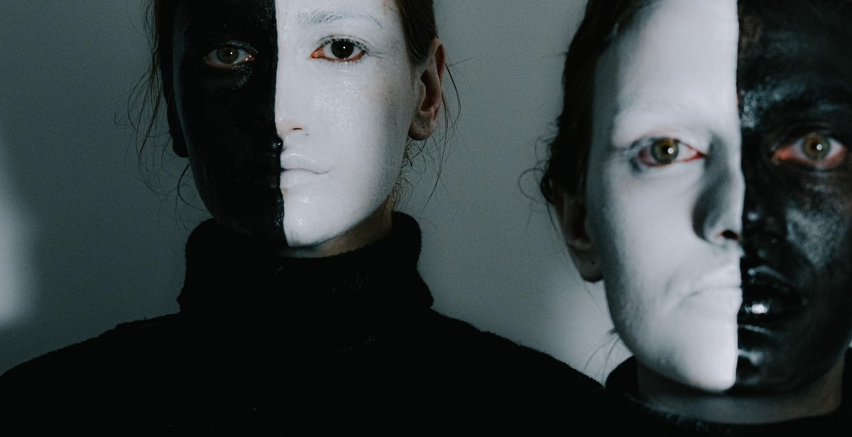
Contrast colors are colors that are opposite each other on the color wheel. They create a high level of contrast and can be used to draw attention to specific elements in your design. For example, black and white create a high level of contrast and can be used to highlight text or images.
Complementary colors are colors that are opposite each other on the color wheel. They create a harmonious look and can be used to create a color scheme that is visually appealing. For example, blue and orange are complementary colors that work well together.
In conclusion, using color psychology in design can help you create emotional impact and visual harmony in your designs. By choosing colors for emotional impact, creating visual harmony with colors, and using contrast and complementary colors, you can create designs that are visually appealing and effective in communicating your message to your target audience.
Applying Color Psychology in Different Design Fields
Color psychology is a powerful tool for designers looking to create emotional impact and visual harmony in their work. By understanding the meanings and associations behind different colors, designers can use color to evoke specific emotions and reactions from their audience. Here are some ways that color psychology can be applied in different design fields:
Web Design
In web design, color is used to create a visual hierarchy and guide the user’s eye to important information. For example, using a bright and contrasting color for a call-to-action button can draw attention and encourage users to click. Color can also be used to establish a brand identity and create a memorable user experience. For example, the bold and vibrant colors used by Airbnb create a sense of energy and excitement, while the muted and calming colors used by Dropbox convey a sense of reliability and professionalism.
Graphic Design
In graphic design, color is used to create a mood or tone for the piece. For example, using warm colors like reds and oranges can create a sense of excitement and energy, while cool colors like blues and greens can create a sense of calm and relaxation. Color can also be used to create contrast and draw attention to specific elements of the design. For example, using a bright and contrasting color for the headline of a poster can make it stand out and grab the viewer’s attention.
Interior Design
In interior design, color is used to create a specific atmosphere or mood in a space. For example, using warm colors like yellows and oranges in a living room can create a sense of warmth and coziness, while cool colors like blues and greens in a bedroom can create a sense of calm and relaxation. Color can also be used to create contrast and highlight specific elements of the space. For example, using a bright and contrasting color for an accent wall can draw attention and create visual interest.
| Design Field | Example |
|---|---|
| Web Design |  |
| Graphic Design |  |
| Interior Design |  |
By understanding the principles of color psychology, designers can create designs that are not only visually appealing but also emotionally impactful. Whether it’s in web design, graphic design, or interior design, color can be a powerful tool for creating a specific mood or tone and guiding the user’s experience.

Conclusion
Color psychology is a powerful tool that can be used to create emotional impact and visual harmony in design. By understanding the meanings and associations of different colors, designers can choose the right colors to convey the desired message and evoke the right emotions in their audience.
Warm colors like red, orange, and yellow can evoke feelings of passion, excitement, and energy, while cool colors like blue, green, and purple can evoke feelings of calmness, tranquility, and serenity. Neutral colors like black, white, and gray can be used to create a sense of sophistication and elegance, or to provide a neutral backdrop for other colors.
When using color psychology in design, it’s important to consider the context and the audience. Different cultures and age groups may have different associations with certain colors, so it’s important to do research and test designs with different audiences to ensure that the desired message is being conveyed.
Overall, the use of color psychology in design can greatly enhance the effectiveness of a design by creating a strong emotional impact and visual harmony. By understanding the meanings and associations of different colors, designers can create designs that not only look great but also communicate the desired message to the audience.