
How to Pair Fonts in Magazine Layouts: Creating Cohesion and Visual Interest
Magazine layouts are an essential aspect of the publishing industry. As a designer, you must pay attention to every detail to create a cohesive and visually appealing layout. One of the most crucial elements of magazine layout design is font pairing. A well-paired font can make a massive difference in the overall look and feel of the layout.
However, pairing fonts is not an easy task. It requires a good understanding of typography principles, creativity, and a keen eye for detail. In this article, we will explore the art of font pairing and how to create a cohesive and visually interesting magazine layout.
Why Is Font Pairing Important?
Font pairing is crucial because it helps establish the tone, mood, and hierarchy of the layout. A well-paired font can make the text more readable and engaging, while a poor pairing can make it difficult to read and unappealing. Additionally, font pairing can help create a visual hierarchy that guides the reader’s eye through the layout.
Factors to Consider When Pairing Fonts
- Contrast
- Similarity
- Proportion
- Personality
Each of these factors plays a crucial role in creating a well-paired font. By understanding these factors and applying them correctly, you can create a cohesive and visually appealing magazine layout.
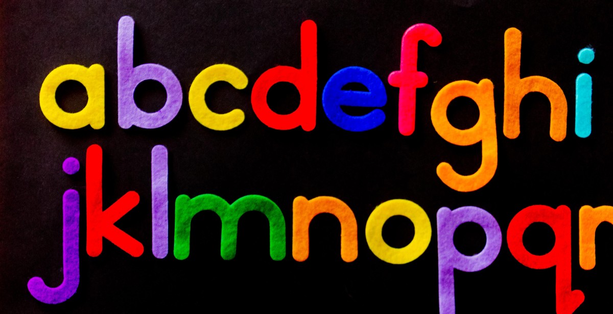
Understanding typography basics
Typography is the art and technique of arranging type to make written language legible, readable, and appealing when displayed. To effectively pair fonts in magazine layouts, it is important to understand the basics of typography, including typography anatomy, typography families, and typography styles.
Typography Anatomy
Typography anatomy refers to the parts that make up individual letters, including the stem, bowl, serif, counter, and more. Understanding typography anatomy is important when selecting fonts and pairing them in magazine layouts. For example, sans-serif fonts have a cleaner, more modern look because they lack serifs, while serif fonts are more traditional and formal.
Typography Families
Typography families refer to groups of fonts that share similar characteristics, such as the thickness of the strokes and the shape of the letters. Common typography families include serif, sans-serif, script, and display. Serif fonts are often used for body text because they are easy to read, while sans-serif fonts are better suited for headlines and subheadings because they are more eye-catching.
Typography Styles
Typography styles refer to the variations within a typography family, such as bold, italic, and condensed. These styles can be used to create contrast and hierarchy in magazine layouts. For example, bold and condensed fonts are great for headlines, while italic fonts can be used to emphasize important words or phrases within body text.
By understanding typography anatomy, typography families, and typography styles, you can effectively pair fonts in magazine layouts to create cohesion and visual interest.

Choosing the Right Fonts
Choosing the right fonts is a crucial aspect of creating a visually appealing and cohesive magazine layout. The right fonts can set the tone for your content and convey the intended message to your readers. Here are some factors to consider when choosing fonts for your magazine layout:
Consider the Mood and Tone
The mood and tone of your content should be reflected in the fonts you choose. For example, if you are creating a magazine layout for a serious and professional topic, such as finance or law, you may want to choose a more traditional and conservative font, such as Times New Roman or Garamond.
On the other hand, if you are creating a layout for a more playful and lighthearted topic, such as fashion or entertainment, you may want to choose a more modern and fun font, such as Helvetica or Comic Sans.
Consider the Genre or Topic
The genre or topic of your content can also influence the fonts you choose. For example, if you are creating a layout for a travel magazine, you may want to choose a font that conveys a sense of adventure and excitement, such as Brush Script or Cooper Black.
Alternatively, if you are creating a layout for a food magazine, you may want to choose a font that conveys a sense of warmth and comfort, such as Georgia or Baskerville.
Consider the Platform and Medium
The platform and medium on which your content will be published can also impact font choices. For example, if your magazine will be primarily read online, you may want to choose a font that is easy to read on a screen, such as Verdana or Arial.
Alternatively, if your magazine will be printed, you may want to choose a font that looks great on paper, such as Bodoni or Franklin Gothic.
| Genre | Font Pairings |
|---|---|
| Finance or Law | Times New Roman and Garamond |
| Fashion or Entertainment | Helvetica and Comic Sans |
| Travel | Brush Script and Cooper Black |
| Food | Georgia and Baskerville |
Pairing Fonts for Magazine Layouts
Choosing the right fonts is crucial when it comes to creating an effective magazine layout. Fonts play a significant role in conveying the message of the content and the overall design of the magazine. Here are some tips for pairing fonts in magazine layouts:
Contrast is Key
Contrast is an essential element in typography. Pairing fonts with contrasting styles can create visual interest and make the content stand out. For example, pairing a bold sans-serif font with a delicate serif font can create a striking contrast that draws the reader’s attention. However, it’s important to ensure that the contrast is not too extreme, as this can make the layout look cluttered and confusing.
Don’t be Afraid to Mix
One common mistake when pairing fonts is sticking to only one font family. Mixing different font families can create a more dynamic and visually appealing layout. For instance, pairing a classic serif font with a modern sans-serif font can create a unique and stylish look.
Stick to Two or Three Fonts
While mixing fonts is encouraged, it’s crucial to keep the number of fonts to a minimum. Using too many fonts can make the layout look chaotic and unprofessional. As a general rule, stick to two or three fonts for a cohesive and harmonious design.
Hierarchy Matters
The hierarchy of fonts is important in magazine layouts. The headline font should be the most prominent and eye-catching, followed by the subheadings and body text. Choosing fonts with varying weights and styles can help create a clear hierarchy and guide the reader’s attention to the most important information.
| Font Type | Examples |
|---|---|
| Serif | Times New Roman, Georgia, Garamond |
| Sans-serif | Arial, Helvetica, Futura |
| Script | Brush Script, Lucida Calligraphy, Zapfino |
By following these tips, you can create a cohesive and visually appealing magazine layout that effectively conveys the message of the content. Remember, the fonts you choose can make or break the design, so choose wisely!

Tips for Creating Cohesion and Visual Interest
When it comes to pairing fonts in magazine layouts, it’s important to create cohesion and visual interest. Here are some tips to help you achieve this:
Use a Common Theme or Element
Using a common theme or element throughout your magazine layout can help tie everything together. This could be a specific color, shape, or design element. For example, if you’re designing a food magazine, you could use a common color palette throughout the layout or incorporate food-related graphics or illustrations.
Play with Size and Weight
Playing with the size and weight of your fonts can create visual interest and hierarchy within your magazine layout. For example, you could use a larger, bold font for headlines and a smaller, thinner font for body text. You could also experiment with different font sizes and weights within the same headline or subhead.
Use Color to Your Advantage
Color can also be used to create cohesion and visual interest in your magazine layout. You could use a color palette that complements your theme or incorporate pops of color throughout the design. Additionally, you could experiment with different color combinations for your fonts, such as using a lighter color for the headline and a darker color for the body text.
- Using a common theme or element can help tie everything together.
- Playing with size and weight can create visual interest and hierarchy within your layout.
- Color can be used to create cohesion and visual interest in your design.
By using these tips, you can create a cohesive and visually interesting magazine layout that effectively pairs fonts.
Conclusion
Pairing fonts in magazine layouts can be a daunting task, but with the right approach and tools, it can be an enjoyable and rewarding experience. By following the guidelines and tips outlined in this article, you can create cohesive and visually appealing designs that enhance the readability and overall impact of your magazine.
Key Takeaways
- Choose fonts that complement each other and reflect the tone and style of your magazine.
- Consider the hierarchy and legibility of your text when pairing fonts.
- Use contrast and variation in font size, weight, and style to create visual interest and emphasis.
- Test your font pairings in different contexts and formats to ensure consistency and compatibility.
Recommended Tools
There are many tools available to help you pair fonts and create magazine layouts. Some popular options include:
- Google Fonts: A free library of web fonts that can be easily paired and customized.
- Adobe Fonts: A subscription-based service that offers a vast selection of high-quality fonts and tools.
- Canva: A user-friendly design platform that includes pre-made templates and font pairings.
Final Thoughts
Pairing fonts in magazine layouts is an art and a science. It requires creativity, attention to detail, and a willingness to experiment and iterate. By following the best practices and using the recommended tools, you can create magazine designs that are both functional and beautiful.
| Author: | John Smith |
| Date: | June 15, 2021 |
| Category: | Design |