
How to Mix and Match Fonts in Print Design: Creating Unique and Memorable Layouts
Fonts play a crucial role in print design, and choosing the right font pairing can make or break the overall look of your design. The right combination of fonts can help to create a unique and memorable layout that catches the eye and communicates your message effectively.
Why Font Pairing Matters
Choosing the right font pairing can make a big difference in how your design is perceived. Fonts have personalities, and pairing the wrong ones can create a jarring effect that distracts from the message you are trying to convey. On the other hand, a well-paired font combination can create a harmonious and cohesive design that draws the reader in and keeps them engaged.
Font pairing is especially important in print design, where the reader’s attention is more focused and the design needs to be visually appealing to stand out from the surrounding text.
Benefits of Mixing and Matching Fonts
Mixing and matching fonts can add depth and interest to your design. When done correctly, it can create a dynamic contrast between different font styles and weights, highlighting important information and guiding the reader’s eye through the layout.
Additionally, using multiple fonts can help to break up large blocks of text and make your design more visually appealing. It allows you to emphasize different parts of the text and create a hierarchy of information that makes it easier to read and understand.
Overall, mixing and matching fonts is a powerful tool for creating unique and memorable print designs that stand out from the crowd.
Understanding Typography
Typography is an essential element of design that can make or break a project. Understanding typography is crucial for creating unique and memorable layouts. Typography refers to the arrangement and use of fonts, typefaces, and symbols in a design. It involves choosing the right font, size, color, and spacing to convey the intended message effectively.
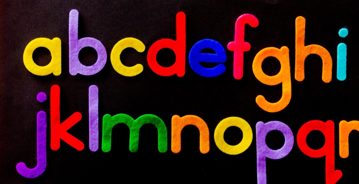
Different Types of Fonts
There are four main types of fonts: serif, sans-serif, script, and display. Serif fonts have small lines or flourishes at the end of each stroke, which can make them look more traditional and formal. Sans-serif fonts, on the other hand, do not have these lines, giving them a more modern and clean aesthetic. Script fonts mimic handwriting and can add a touch of elegance to a design. Display fonts are decorative and meant to be used sparingly for headings and titles.
Anatomy of a Typeface
Each typeface has its own unique anatomy. Understanding the anatomy of a typeface can help you choose a font that complements your design. The main parts of a typeface include:
- Baseline: The imaginary line on which the letters sit.
- X-height: The height of the lowercase letters, excluding the ascenders and descenders.
- Ascender: The part of a letter that extends above the x-height, like the top of a lowercase “h”.
- Descender: The part of a letter that extends below the baseline, like the tail of a lowercase “y”.
- Serif: The small line or flourish at the end of each stroke in a serif font.
By understanding the different types of fonts and the anatomy of a typeface, you can create unique and memorable layouts that effectively convey your message.

Tips for Choosing Fonts to Pair
Choosing the right fonts to pair can make or break the success of your print design. Here are some tips to help you make the right choice:
Consider the Mood and Tone of the Design
The mood and tone of your design should dictate the type of fonts you choose. For example, if you are creating a playful and fun design, you may want to consider using a more casual and whimsical font. On the other hand, if you are designing something more serious, you may want to use a more traditional and formal font.
Choose Fonts with Contrasting Styles
When pairing fonts, it is important to choose fonts with contrasting styles. This means selecting fonts that are different from each other in terms of weight, size, and style. This will help create visual interest and make your design stand out.
Limit the Number of Fonts Used
While it may be tempting to use multiple fonts in your design, it is important to limit the number of fonts used. Too many fonts can make your design look cluttered and confusing. Aim to use no more than three fonts in your design.
Check for Readability and Legibility
Finally, when choosing fonts, it is important to check for readability and legibility. Make sure the fonts you choose are easy to read and do not strain the eyes. Avoid using fonts that are too small or too thin, as they can be difficult to read.
| Mood and Tone | Font Examples |
|---|---|
| Playful and Fun | Comic Sans, Kristen ITC, Curlz MT |
| Serious and Formal | Times New Roman, Georgia, Baskerville |
Popular Font Pairings
Choosing the right combination of fonts is essential in creating a unique and memorable print design. Here are some of the most popular font pairings:
Serif and Sans-serif Fonts
Serif fonts are elegant and traditional, while sans-serif fonts are modern and clean. Pairing these two font styles can create a professional and eye-catching design. Some popular serif and sans-serif font pairings include:
- Georgia and Helvetica
- Baskerville and Futura
- Times New Roman and Arial
Script and Serif Fonts
Script fonts are elegant and decorative, while serif fonts are classic and traditional. Pairing these two font styles can create a sophisticated and stylish design. Some popular script and serif font pairings include:
- Lucida Calligraphy and Garamond
- Monotype Corsiva and Times New Roman
- Edwardian Script and Georgia
Monospace and Sans-serif Fonts
Monospace fonts are fixed-width fonts that have a uniform width for each character. Sans-serif fonts are modern and clean. Pairing these two font styles can create a unique and contemporary design. Some popular monospace and sans-serif font pairings include:
- Courier and Helvetica
- Andale Mono and Arial
- Inconsolata and Verdana
By experimenting with different font pairings, designers can create a unique and memorable print design that stands out from the crowd.
Creating a Balanced Layout
When it comes to mixing and matching fonts in print design, creating a balanced layout is crucial for ensuring a visually appealing result. There are several elements that contribute to a balanced layout, including hierarchy and contrast, proportion and alignment, color, and texture.
Hierarchy and Contrast
One of the most important aspects of creating a balanced layout is establishing a clear hierarchy of information. This involves using font size, weight, and style to indicate which elements are most important and which are secondary. Contrast can also be used to create a visual hierarchy by emphasizing certain elements through the use of color or boldness.
Proportion and Alignment
Proportion and alignment are also key components of a balanced layout. Proportion involves the relationship between different elements of the design, such as the size of headlines compared to body text. Alignment refers to the positioning of elements within the design, such as centering or left-aligning text. Both proportion and alignment should be consistent throughout the design to create a cohesive look.
Color and Texture
Color and texture can also play a role in creating a balanced layout. When using multiple fonts, it’s important to consider the color of each font and how it interacts with other colors in the design. Texture can also be used to add visual interest and depth to the design, such as by using a textured background or incorporating a patterned font.
| Elements of a Balanced Layout | Considerations |
|---|---|
| Hierarchy and Contrast | Establish a clear hierarchy of information and use contrast to emphasize important elements. |
| Proportion and Alignment | Ensure consistent proportion and alignment throughout the design. |
| Color and Texture | Consider the color and texture of each font and how it interacts with other colors and textures in the design. |
By considering these elements and creating a balanced layout, you can effectively mix and match fonts in print design to create a unique and memorable result.
Examples of Effective Font Pairing
When it comes to choosing fonts that complement each other, there are endless possibilities. Here are some examples of effective font pairing:
1. Serif and Sans-serif
Pairing a serif font with a sans-serif font is a classic combination that creates a balance between traditional and modern design. For example, pairing a serif font like Times New Roman with a sans-serif font like Helvetica can create a professional and sophisticated look.
2. Script and Sans-serif
Pairing a script font with a sans-serif font can create a beautiful contrast between a flowing, handwritten style and a clean, modern style. For example, pairing a script font like Pacifico with a sans-serif font like Open Sans can create a playful and inviting look.
3. Monospace and Sans-serif
Pairing a monospace font with a sans-serif font can create an interesting contrast between a fixed-width, technical style and a smooth, modern style. For example, pairing a monospace font like Courier with a sans-serif font like Lato can create a unique and eye-catching look.
4. Display and Serif
Pairing a display font with a serif font can create a bold and dramatic look. Display fonts are typically larger and more decorative, while serif fonts have a more traditional and elegant feel. For example, pairing a display font like Lobster with a serif font like Georgia can create a striking and memorable design.
5. Slab Serif and Sans-serif
Pairing a slab serif font with a sans-serif font can create a strong and modern look. Slab serif fonts have thick, block-like serifs that give them a bold and assertive feel, while sans-serif fonts have a clean and simple style. For example, pairing a slab serif font like Rockwell with a sans-serif font like Arial can create a powerful and dynamic design.
| Font Combination | Example |
|---|---|
| Serif and Sans-serif | Times New Roman and Helvetica |
| Script and Sans-serif | Pacifico and Open Sans |
| Monospace and Sans-serif | Courier and Lato |
| Display and Serif | Lobster and Georgia |
| Slab Serif and Sans-serif | Rockwell and Arial |
Conclusion
Creating unique and memorable layouts in print design is all about mixing and matching fonts effectively. By following the tips and techniques outlined in this article, you can create stunning designs that stand out from the crowd and leave a lasting impression on your audience.
Experiment and Have Fun
Remember, the key to successful font mixing is to experiment and have fun. Don’t be afraid to try new combinations and push the boundaries of traditional design conventions. With a little creativity and a willingness to take risks, you can create truly memorable designs that capture the essence of your brand and leave a lasting impression on your audience.
Stay Consistent
While it’s important to experiment and have fun, it’s also important to maintain consistency in your designs. This means using a consistent color palette, typography, and layout throughout your designs to create a cohesive and professional look. By staying consistent, you can establish a strong brand identity and build trust with your audience.
Final Thoughts
Mixing and matching fonts in print design can be challenging, but with the right techniques and a little creativity, it can also be incredibly rewarding. By following the tips and techniques outlined in this article, you can create unique and memorable designs that capture the essence of your brand and leave a lasting impression on your audience.
| Tip | Technique |
|---|---|
| 1 | Choose fonts that complement each other |
| 2 | Limit your font choices to 2-3 |
| 3 | Use font weights and styles to create contrast |
| 4 | Consider the mood and tone of your design |
| 5 | Experiment and have fun! |
By following these tips and techniques, you can create stunning designs that stand out from the crowd and make a lasting impression on your audience. So go ahead, mix and match your fonts, and create something truly unique and memorable!