
How to Design a Typographic Book Cover: Grabbing Attention with Typography
When it comes to designing a book cover, typography plays a crucial role in grabbing the reader’s attention. A book cover with well-designed typography can make a huge impact on potential readers and can even increase the book’s sales. Therefore, it is essential to understand the basics of typography and how to use it effectively in book cover design.
The Importance of Typography in Book Cover Design
Typography is the art of arranging type to make written language legible, readable, and appealing when displayed. In book cover design, typography can help convey the book’s genre, tone, and overall message. The typography used on a book cover can also create a visual hierarchy, guiding the reader’s eye to the most important information.
Choosing the Right Typeface
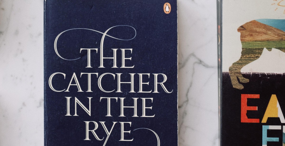
Choosing the right typeface is crucial in book cover design. It should reflect the genre, tone, and message of the book. Serif typefaces are typically used for traditional and classic literature, while sans-serif typefaces are used for contemporary and modern books. Display typefaces are ideal for book titles, as they are designed to be attention-grabbing and visually striking.
Designing the Layout
When designing the layout, it is important to consider the placement of the title, author name, and any other important information. The typography should be legible and easy to read, even from a distance. The layout should also be balanced and visually appealing.
In conclusion, typography is a vital aspect of book cover design that should not be overlooked. By choosing the right typeface, designing the layout effectively, and creating a visual hierarchy, you can grab the reader’s attention and make your book stand out on the shelves.

Understanding Typography
Typography plays a crucial role in book cover design. It is the art of arranging type to make written language legible, readable, and appealing when displayed. Typography can convey a message, evoke emotions, or grab the attention of potential readers. As a book cover designer, it is essential to understand the role of typography and the elements to consider when designing a typographic book cover.
The Role of Typography in Book Cover Design
Typography is a critical element in book cover design because it is the first thing that potential readers see. The typography used on a book cover can either attract or repel potential readers. The right typography can evoke emotions, convey the genre, and set the tone for the book. Typography can also help create a unique identity for a book and make it stand out in a crowded market.
When designing a typographic book cover, it is essential to choose typography that complements the book’s genre, theme, and tone. The typography should also be legible and readable, even at small sizes. The right typography can help the book cover achieve its goal of grabbing the attention of potential readers and convincing them to pick up the book.
Typography Elements to Consider
When designing a typographic book cover, there are several typography elements to consider:
- Typeface: The typeface is the design of the letters and characters used in the typography. It is essential to choose a typeface that complements the book’s genre, theme, and tone.
- Font Size: The font size is the size of the typeface used in the typography. The font size should be legible and readable, even at small sizes.
- Color: The color of the typography should complement the book’s cover image and overall design. It should also be legible and readable, even when placed on a busy background.
- Alignment: The alignment of the typography can create a sense of balance and order or chaos and disorder. It is essential to choose an alignment that complements the book’s theme and tone.
- Spacing: The spacing between letters, words, and lines can affect the legibility and readability of the typography. It is essential to choose a spacing that makes the typography easy to read.
By considering these typography elements, a book cover designer can create a typographic book cover that grabs the attention of potential readers and convinces them to pick up the book.

Choosing the Right Typeface
Choosing the right typeface is essential when designing a typographic book cover. It can make or break the entire design. Here are some tips to help you choose the right typeface:
Serif vs. Sans Serif Fonts
Serif fonts have small lines or flourishes at the end of each letter, while sans serif fonts do not. Serif fonts are often seen as more traditional and formal, while sans serif fonts are considered more modern and clean. When choosing between the two, consider the tone and style of your book. A serif font may work well for a historical novel, while a sans serif font may be more appropriate for a contemporary design.
Font Pairing Techniques
Font pairing is the art of choosing two or more typefaces that complement each other and create a harmonious design. Here are a few techniques to help you pair fonts:
- Contrast: Pairing a bold, heavy font with a light, delicate font creates visual interest and contrast.
- Similarity: Pairing two fonts that have similar characteristics, such as similar x-heights or stroke widths, creates a cohesive design.
- Complementary: Pairing fonts that are opposite in style, such as a serif and a sans-serif font, creates a dynamic and interesting design.
When pairing fonts, it’s important to consider the hierarchy of the text. The main title should be the most prominent and eye-catching element, while the subtitle and author name should be secondary. Pairing a bold, attention-grabbing font with a more subtle font for the subtitle and author name can create a balanced and effective design.
| Contrast | Similarity | Complementary |
|---|---|---|
 |
 |
 |
Layout and Composition
Creating a typographic book cover involves more than just selecting a font. The layout and composition of the typography is just as important in grabbing the reader’s attention and conveying the message of the book.
Hierarchy and Readability
One of the key elements of a successful typographic book cover is hierarchy. Hierarchy refers to the visual arrangement of the typography on the cover, with the most important information being the most prominent. This could be the title of the book, the author’s name, or a tagline.
Using varying font sizes, weights, and styles can help establish hierarchy and guide the reader’s eye to the most important information. However, it’s important to maintain readability and avoid overwhelming the reader with too many fonts or styles.
Balancing Text and Graphics
Another important aspect of layout and composition is balancing the text with any graphics or images on the cover. The typography should complement the visual elements and work together to create a cohesive design.
Consider the placement of the text in relation to the graphics and the negative space around them. Using a grid system can help ensure a balanced layout and consistent spacing between elements.
| Tip: | Experiment with different layouts and compositions before settling on a final design. Try out different font combinations, placement of text, and use of negative space to see what works best for the book’s message and target audience. |
|---|

Color and Contrast
Color theory and psychology play a significant role in designing a typographic book cover. Colors have the power to evoke emotions, convey meanings, and influence perceptions. Therefore, it is essential to choose the right color palette that aligns with the book’s genre, theme, and target audience.
Color Theory and Psychology
Color theory is the study of how colors interact and how they can be combined to create visually appealing designs. It involves understanding the color wheel, which is a visual representation of the primary, secondary, and tertiary colors. The color wheel helps designers choose complementary colors that create a harmonious and balanced design.
Color psychology, on the other hand, is the study of how colors affect human behavior and emotions. For example, red is associated with passion, energy, and excitement, while blue conveys trust, calmness, and reliability. By understanding color psychology, designers can use colors strategically to evoke the desired emotions and feelings in the target audience.
Using Contrast to Create Visual Interest
Contrast is the difference between two elements in a design. It can be achieved through color, size, shape, texture, and typography. Contrast creates visual interest and helps the viewer distinguish between different elements in the design.
When it comes to typography, contrast is crucial for legibility and readability. The contrast between the typeface and the background color should be high enough to ensure that the text is easy to read. Designers can also use contrast to highlight specific words or phrases, creating emphasis and hierarchy.
When choosing colors for a typographic book cover, designers should consider using contrasting colors to create visual interest. For example, a black and white cover with a pop of bright red can create a striking and memorable design. Similarly, a cover with complementary colors can create a harmonious and balanced design.
Conclusion
Color and contrast are essential elements of designing a typographic book cover. By understanding color theory and psychology, designers can choose the right color palette that aligns with the book’s genre, theme, and target audience. Using contrast strategically can create visual interest and enhance the readability and legibility of the text.
Putting It All Together
Designing a typographic book cover that grabs attention with typography requires careful consideration of several factors. Here are the key takeaways:
- Choose a font that reflects the book’s genre and tone.
- Experiment with different font sizes and styles to create contrast and hierarchy.
- Consider using color to enhance the typography and make it stand out.
- Use negative space to give the typography room to breathe and create balance.
- Think about the placement and alignment of the typography to create a visually pleasing composition.
- Test the design in different sizes and formats to ensure it looks good across all platforms.
Remember that the typography is just one aspect of the book cover design. It should work in harmony with other elements such as images, graphics, and layout to create a cohesive and compelling design.
By following these guidelines and using your creativity, you can design a typographic book cover that not only grabs attention but also accurately reflects the content and tone of your book.
| Factor | Considerations |
|---|---|
| Font | Reflects genre and tone |
| Size and Style | Create contrast and hierarchy |
| Color | Enhance typography and make it stand out |
| Negative Space | Create balance and room to breathe |
| Placement and Alignment | Create visually pleasing composition |
| Testing | Ensure design looks good across all platforms |