
How to Choose the Perfect Font Combination for Your Website: Enhancing Readability and Aesthetics
When it comes to designing a website, choosing the right font combination is crucial. A website’s font is not only responsible for the readability of its content but also plays a vital role in the overall aesthetics of the site.
Why Choosing the Right Font Combination is Important
The font you choose can affect how users perceive your website. A good font combination can make your website look professional, modern, and easy to read. On the other hand, a poor font choice can make your site look amateurish, difficult to read, and unappealing.
What Makes a Good Font Combination
A good font combination should be easy to read, visually pleasing, and consistent with your website’s overall style. It should also complement the content and not distract from it.
How to Use Fonts to Enhance Readability and Aesthetics
There are several ways to use fonts to enhance the readability and aesthetics of your website. One of the most effective ways is to use a font pairing that complements each other. Another way is to use font size and spacing to improve legibility. It’s also essential to consider the color of the font and the background to ensure that the text is easy to read.
By choosing the right font combination, you can enhance the readability and aesthetics of your website, making it more appealing to users and improving their overall experience.
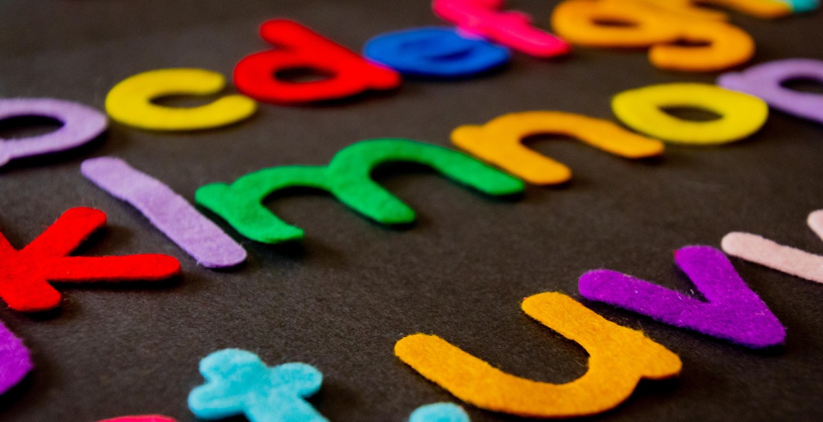
Understanding Fonts
When it comes to creating a website, choosing the right font combination is crucial for both aesthetics and readability. Understanding the different types of fonts, the role of serif and sans-serif fonts, and the importance of font size and spacing can help you make informed decisions when selecting fonts for your website.
The Different Types of Fonts
There are four main types of fonts: serif, sans-serif, script, and display. Serif fonts have small lines or flourishes at the ends of the letters, while sans-serif fonts do not. Script fonts mimic handwriting and have a more decorative feel, while display fonts are bold and attention-grabbing.
- Serif fonts: Times New Roman, Georgia, Baskerville
- Sans-serif fonts: Arial, Helvetica, Verdana
- Script fonts: Brush Script, Lucida Handwriting, Monotype Corsiva
- Display fonts: Impact, Cooper Black, Broadway
The Role of Serif and Sans-serif Fonts
Serif fonts are often used for printed materials such as books and newspapers, as the small lines at the end of the letters help guide the eye from one letter to the next. Sans-serif fonts, on the other hand, are often used for digital materials such as websites, as they are easier to read on screens and at smaller sizes.
The Importance of Font Size and Spacing
Font size and spacing also play a critical role in the readability of your website. Fonts that are too small or too tightly spaced can strain the eyes and make it difficult for users to read your content. On the other hand, fonts that are too large or spaced too far apart can look unprofessional and cluttered.
| Font Size | Recommended Use |
|---|---|
| 8-12px | Small body text, footnotes, captions |
| 14-18px | Body text, headings, subheadings |
| 20-24px | Large headings, titles |
Proper spacing between letters, words, and lines is also important for readability. Too little spacing can make text look crowded and difficult to read, while too much spacing can create awkward gaps and disrupt the flow of your content.

Choosing the Right Font Combination
Choosing the perfect font combination for your website can be a daunting task. With so many options available, it can be difficult to know where to start. However, there are some basic rules that can help you make the right decision.
The Rule of Three
The rule of three is a popular design principle that suggests using no more than three fonts on your website. This helps to create consistency and simplify the design. Using too many fonts can make your website look cluttered and confusing.
Pairing Serif and Sans-serif Fonts
When choosing fonts, it’s important to consider the readability of your content. Serif fonts are ideal for printed materials, but they can be difficult to read on screens. Sans-serif fonts, on the other hand, are easier to read on screens but can sometimes appear too casual. A great way to balance the two is to pair a serif font with a sans-serif font. This creates a nice contrast and helps to enhance the readability of your content.
Using Font Contrast to Create Hierarchy
Font contrast is an effective way to create hierarchy on your website. By using different font sizes, weights, and styles, you can guide your readers through your content and highlight important information. For example, you can use a larger, bold font for your headlines and a smaller, lighter font for your body text. This helps to create a clear visual hierarchy and makes your content easier to read.
Avoiding Font Overload
While it’s important to choose the right font combination, it’s equally important to avoid font overload. This means using too many fonts or using fonts that are too similar. Stick to a maximum of three fonts and make sure they complement each other well. Also, avoid using decorative fonts for your body text as they can be difficult to read.
| Do: | Don’t: |
|---|---|
|
|

Tools for Choosing Font Combinations
Choosing the perfect font combination can be a daunting task, especially if you are not a designer. Fortunately, there are several tools that can help you simplify the process. Here are some of the best tools for choosing font combinations:
Google Fonts
Google Fonts is a free and easy-to-use platform that offers a wide variety of fonts. You can search for fonts by category, language, popularity, and more. Additionally, Google Fonts provides a helpful feature that allows you to preview font combinations before you make a final decision. This tool is great for beginners who want to experiment with different font combinations.
Adobe Typekit
Adobe Typekit is a paid font service that offers high-quality and professional fonts. It has a vast library of fonts that can be used for various design projects. You can browse through the fonts by classification, popularity, and more. Adobe Typekit also provides a feature that allows you to test font combinations before you commit to using them.
FontPair
FontPair is a free tool that offers font combinations that are curated by designers. It provides a list of font combinations that are aesthetically pleasing and easy to read. You can browse through the font combinations by style, mood, and more. This tool is perfect for those who want to save time and go straight to using pre-selected font combinations.
Canva Font Combinations
Canva is a popular graphic design tool that offers a wide range of design templates, including font combinations. Canva Font Combinations is a free tool that provides a list of font combinations that are suitable for various design projects. You can browse through the font combinations by style, mood, and more. This tool is great for those who want to create professional-looking designs without spending too much time on font selection.
| Tool | Price | Features |
|---|---|---|
| Google Fonts | Free | Wide variety of fonts, preview font combinations |
| Adobe Typekit | Paid | High-quality and professional fonts, test font combinations |
| FontPair | Free | Curated font combinations, browse by style and mood |
| Canva Font Combinations | Free | Professional-looking font combinations, browse by style and mood |
Overall, these tools can help you choose the perfect font combination for your website. Whether you are a beginner or a professional designer, these tools can simplify the font selection process and enhance the readability and aesthetics of your website.

Implementing Font Combinations on Your Website
Now that you have chosen the perfect font combination for your website, it’s time to implement it. Here are some tips to help you get it right:
Consider Your Brand and Audience
Ensure that the fonts you have chosen align with your brand and target audience. For example, if your website is for a law firm, you may want to use more traditional and formal fonts. However, if your website is for a creative agency, you may want to use more playful and modern fonts.
Testing and Tweaking
Before you finalize your font combination, it’s important to test it on different devices and browsers. This will ensure that your fonts are readable and display correctly on all platforms. You may also want to experiment with different font sizes and spacing to find the perfect balance between readability and aesthetics.
Best Practices for Font Implementation
- Use web-safe fonts to ensure that they are available on all devices.
- Limit your font choices to no more than three fonts to avoid overwhelming your audience.
- Use contrasting fonts for headings and body text to improve readability.
- Ensure that your font sizes are legible on all devices, especially on mobile devices.
- Use font pairing tools to help you choose the best font combinations.
By following these best practices, you can ensure that your font combination enhances the readability and aesthetics of your website. Remember to test and tweak until you find the perfect balance between functionality and design.
| Font Type | Best Use |
|---|---|
| Serif | Best for body text on printed materials, such as books and newspapers. |
| Sans-Serif | Best for digital materials, such as websites and apps. |
| Script | Best for decorative purposes, such as invitations and greeting cards. |

Conclusion
Choosing the perfect font combination for your website can be a daunting task, but it is essential for enhancing readability and aesthetics. A well-designed website with a cohesive font combination can make a significant impact on how your content is perceived by your audience.
When selecting fonts, it is crucial to keep in mind the purpose of your website and your target audience. You want to choose fonts that align with your brand and are easy to read across different devices and screen sizes.
Remember to also consider the contrast between your fonts and background to ensure readability. You can use online tools to test your font combinations and ensure they are legible and visually appealing.
In conclusion, a carefully chosen font combination can make a significant impact on your website’s overall design and user experience. Take the time to experiment with different fonts and find the perfect combination that represents your brand and enhances your content’s readability and aesthetics.
Advantages of choosing the perfect font combination:
|
Things to keep in mind:
|