
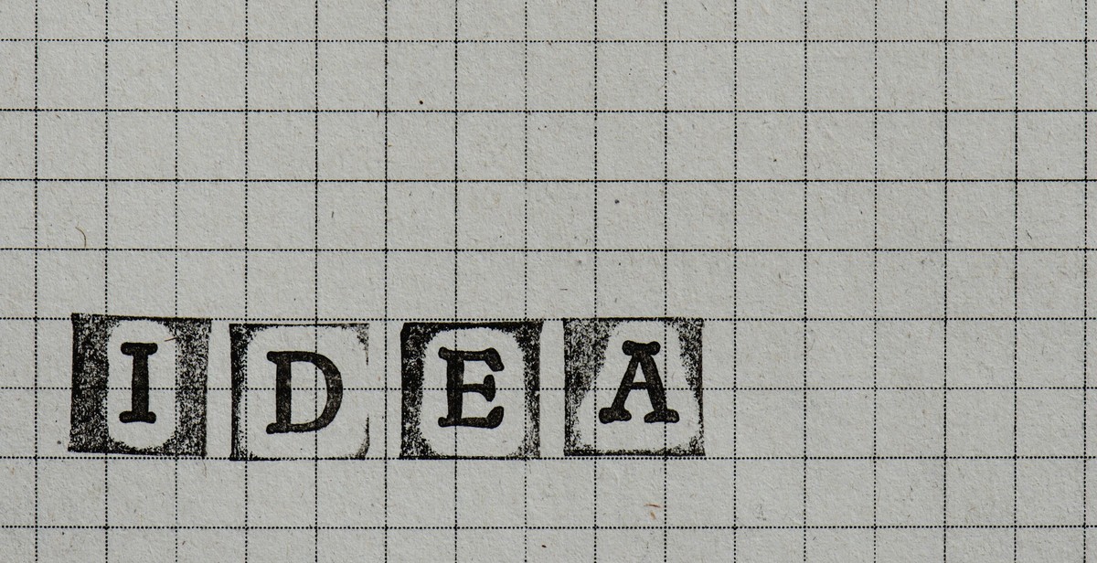
The Importance of Typography in Poster Design
Typography is an essential element in poster design that can make or break the impact of your visual communication. It refers to the art and technique of arranging type to make written language legible, readable, and appealing when displayed. Typography can convey emotions, set the tone, and create a visual hierarchy that guides the viewer’s eyes through the message.
Posters are a popular medium for advertising, promoting events, and conveying information. They are designed to grab attention and communicate a message quickly and effectively. Typography plays a crucial role in achieving this goal. It helps to communicate the message effectively by using the right font, size, color, and spacing.
Typography also helps to establish the visual identity of the poster. By choosing the right font and style, you can create a unique look and feel that reflects the brand or event. It can also help to create a sense of hierarchy and guide the viewer’s eyes through the message.
In this article, we will explore how to use typography in poster design to create impactful visual communication. We will look at the different elements of typography, such as font selection, size, color, and spacing. We will also examine some best practices and tips for using typography effectively in poster design.
Understanding Typography
Typography is an essential element of poster design and visual communication. It refers to the art and technique of arranging type to make written language legible, readable, and appealing when displayed. Understanding typography is crucial in creating impactful posters that effectively communicate your message.
Typography Basics
Typography basics involve understanding the different elements that make up typefaces, including font size, weight, style, and spacing. The font size is the height of the letters, while the weight refers to the thickness or boldness of the letters. The style refers to the design of the letters, such as italic or bold, while the spacing involves the distance between the letters and words.
Typography Hierarchy
Typography hierarchy refers to the arrangement of typefaces to create a visual hierarchy that guides the reader’s eye through the content. The hierarchy helps to distinguish between different levels of information and create a sense of order and structure. The most important information should have the largest font size and be placed at the top, while the least important information should have the smallest font size and be placed at the bottom.
Typography Styles
Typography styles refer to the different types of fonts that can be used in poster design, including serif, sans-serif, script, and display. Serif fonts have small lines or flourishes at the ends of characters, while sans-serif fonts do not. Script fonts are cursive or calligraphic, while display fonts are decorative and used for headlines or titles.
- Serif fonts: Times New Roman, Georgia, Baskerville
- Sans-serif fonts: Arial, Helvetica, Verdana
- Script fonts: Brush Script, Lucida Calligraphy, Zapfino
- Display fonts: Impact, Comic Sans, Papyrus
It is important to choose a font that is appropriate for your message and audience. A serif font may be more suitable for a formal or traditional poster, while a sans-serif font may be more appropriate for a modern or minimalist poster.
| Font Type | Usage |
|---|---|
| Serif | Formal or traditional posters |
| Sans-serif | Modern or minimalist posters |
| Script | Cursive or calligraphic designs |
| Display | Decorative headlines or titles |
Understanding typography basics, hierarchy, and styles is crucial in creating impactful poster designs that effectively communicate your message to your audience.
Choosing the Right Typography for Your Poster
Typography plays a crucial role in creating impactful visual communication through posters. It helps convey the message effectively and captures the attention of the audience. However, choosing the right typography can be a daunting task. Here are some tips to help you choose the right typography for your poster:
Understanding Your Message
The first step in choosing the right typography for your poster is to understand your message. Your typography should reflect the tone and purpose of your message. For example, if you are creating a poster for a formal event, you may want to choose a serif font that conveys elegance and sophistication. On the other hand, if you are creating a poster for a music festival, you may want to choose a bold and playful font that reflects the energy and excitement of the event.
Matching Typography to Your Brand
Your typography should also match your brand. If you already have a logo or established brand identity, you should choose typography that complements it. This will help create a cohesive and consistent visual identity for your brand.
Choosing Fonts That Complement Each Other
When choosing typography for your poster, it is important to choose fonts that complement each other. Using too many different fonts can make your poster look cluttered and confusing. Instead, choose a maximum of three fonts that work well together. For example, you could use a bold sans-serif font for the headline, a serif font for the body text, and a script font for accents or callouts.
Overall, choosing the right typography for your poster requires careful consideration of your message, brand identity, and font choices. By following these tips, you can create a visually compelling poster that effectively communicates your message to your audience.

Designing Your Poster with Typography
Typography is a crucial element of poster design. It can be used to create a hierarchy of information, emphasize certain elements, and create visually appealing layouts. Here are some tips for using typography effectively in your poster design:
Creating a Hierarchy of Information
When designing a poster, it’s important to consider the hierarchy of information. What information is most important? What should be emphasized? Typography can help create a clear hierarchy by using different font sizes, weights, and styles.
For example, the most important information should be the largest and most prominent. This could be the title of the poster or the main message. Secondary information should be slightly smaller, and so on. By creating a clear hierarchy, the viewer can quickly and easily understand the main message of the poster.
Using Typography to Create Emphasis
Typography can also be used to create emphasis and draw attention to certain elements of the poster. This can be achieved through the use of different font styles, colors, and sizes.
For example, if you want to emphasize a particular word or phrase, you could make it bold or italicized. You could also use a different color to make it stand out. This draws the viewer’s attention to that particular element and helps reinforce the main message of the poster.
Playing with Typography Layouts
Typography can also be used to create visually appealing layouts. Playing with different font sizes, styles, and colors can create interesting and dynamic designs.
For example, you could use a large, bold font for the title and a smaller, more delicate font for the body text. You could also experiment with different alignments and spacing to create a unique layout.
It’s important to remember that typography should be used to enhance the overall message of the poster. By creating a clear hierarchy of information, using typography to create emphasis, and playing with different layouts, you can create a visually appealing and impactful poster that effectively communicates your message.

Tips for Effective Typography in Poster Design
Typography is a crucial element in creating impactful visual communication through poster design. Here are some tips to keep in mind:
Keep it Simple
The most effective posters make use of simple typography. Avoid using too many typefaces or styles, as this can be distracting and overwhelming. Stick to one or two fonts that complement each other and keep the design clean and easy to read.
Use Contrast to Your Advantage
Contrast can help make your poster stand out and grab attention. Play with font size, weight, and color to create contrast between different elements of the design. For example, using a bold font for the headline and a lighter font for the body text can help create visual interest and hierarchy.
Pay Attention to Spacing
The spacing between letters, words, and lines can greatly impact the legibility and overall effectiveness of your poster. Make sure to give your typography enough breathing room by adjusting the leading (the space between lines) and kerning (the space between letters) as needed. Additionally, consider the overall composition of the design and leave enough negative space to avoid clutter.
- Stick to one or two fonts that complement each other
- Play with font size, weight, and color to create contrast
- Adjust leading and kerning to improve legibility
- Leave enough negative space to avoid clutter
By keeping these tips in mind, you can create effective and impactful poster designs that effectively communicate your message.

Conclusion
In conclusion, typography is a powerful tool for creating impactful visual communication in poster design. It can convey emotions, messages, and ideas effectively when used correctly. By understanding the different types of fonts, their characteristics, and how they can be combined, designers can create posters that are not only aesthetically pleasing but also effective in delivering their intended message.
When designing a poster, it is important to consider the audience and the purpose of the poster. The typography used should be appropriate for the message and the intended audience. Designers should also pay attention to the hierarchy of information, ensuring that the most important information is highlighted and easily readable.
Additionally, designers should consider the layout and spacing of the typography. A well-designed layout can make the poster more visually appealing and easier to read. Proper spacing can also improve readability and help to create a balanced design.
Finally, it is important to remember that typography is just one aspect of poster design. The use of color, imagery, and other design elements can also play a significant role in creating effective posters. By understanding how typography can be used in conjunction with other design elements, designers can create posters that are not only visually appealing but also effective in delivering their intended message.
| Related Article: | The Importance of Color in Poster Design |