
How to Use Fonts in Typography Art: Adding Visual Interest and Impact
Typography art is a popular form of design that uses text to create visually appealing and impactful pieces. Whether it’s for a poster, website, or social media post, typography art can be a great way to grab attention and communicate a message. One essential element of typography art is the use of fonts.
Fonts are the building blocks of typography art. They can set the tone and mood of a design, convey emotions and ideas, and create visual interest. But with so many different fonts available, it can be overwhelming to know where to start. In this article, we’ll discuss the basics of using fonts in typography art and how to choose the right ones for your design.
The Importance of Choosing the Right Font
Choosing the right font can make or break a design. It can help convey the message and emotion you want to communicate, or it can detract from it. When selecting a font, consider the tone and mood of your design. Is it serious or playful? Elegant or casual? The right font can enhance the overall look and feel of your design.
Understanding Font Families
Fonts are typically categorized into font families. A font family is a group of fonts that share similar characteristics, such as weight, style, and spacing. Understanding font families can help you choose the right font for your design.
- Serif fonts: Serif fonts are characterized by small lines or flourishes at the ends of the strokes that make up each letter. They are traditional and elegant, and are often used in print materials such as books and newspapers.
- Sans-serif fonts: Sans-serif fonts don’t have the small lines or flourishes at the ends of the strokes. They are modern and clean, and are often used in digital materials such as websites and social media posts.
- Script fonts: Script fonts are designed to look like handwriting or calligraphy. They are often used for invitations, greeting cards, and other formal materials.
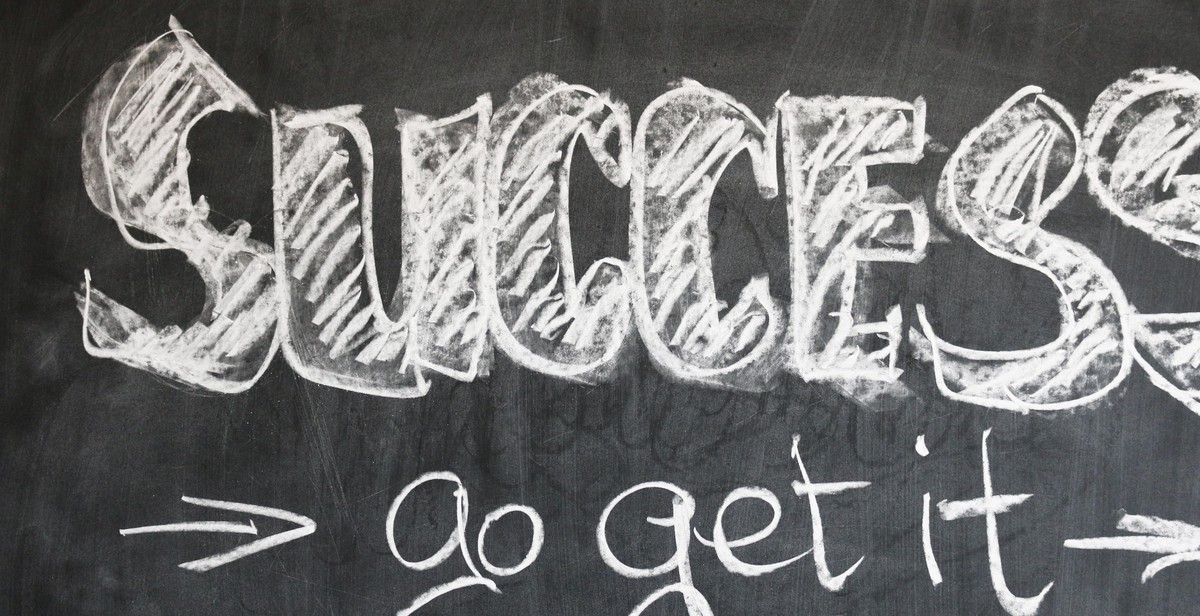
- Display fonts: Display fonts are designed to be used in larger sizes, such as headlines or titles. They are often bold and attention-grabbing.
Conclusion
By understanding the basics of using fonts in typography art, you can create designs that are visually appealing and impactful. Remember to choose the right font for the tone and mood of your design, and consider the different font families to find the perfect match. With the right font, you can take your typography art to the next level.
Understanding Typography and Fonts
Typography is an essential element of any design, including typography art. It involves the art and technique of arranging type to make written language legible, readable, and appealing when displayed. Typography can help to convey a message effectively and create a specific mood or tone. Therefore, it is crucial to understand the basics of typography and fonts to create stunning typography art that adds visual interest and impact.
Typography Basics
Typography has its own set of rules that guide the use of fonts and typefaces. Some of the basics of typography include:
- Font size: The size of the font is important as it affects the readability of the text. The font size should be large enough to read but not too large to overwhelm the design.
- Line spacing: The space between lines of text is called line spacing. It should be adjusted to ensure that the text is easy to read and does not appear cramped or too spaced out.
- Alignment: Text can be aligned to the left, right, center, or justified. The choice of alignment can affect the readability and appearance of the text.
- Font pairing: Fonts can be paired to create contrast or harmony. It is important to choose fonts that complement each other and do not clash.
Fonts and Their Impact on Design
Fonts play a vital role in design as they can convey different emotions and moods. Different fonts have different personalities, and the choice of font can affect the tone of the design. For example, serif fonts are classic and traditional, while sans-serif fonts are modern and clean. Display fonts are decorative and attention-grabbing, while script fonts are elegant and sophisticated.
It is important to choose fonts that complement the message and tone of the design. The font should be legible and easy to read, even at smaller sizes. Using too many fonts can make the design look cluttered and overwhelming. Therefore, it is advisable to limit the number of fonts used in a design.
| Font Type | Personality |
|---|---|
| Serif | Classic, traditional |
| Sans-serif | Modern, clean |
| Display | Decorative, attention-grabbing |
| Script | Elegant, sophisticated |
Understanding typography and fonts is crucial in creating typography art that adds visual interest and impact. By following the basics of typography and choosing the right font for the design, one can create stunning typography art that effectively conveys a message and sets the tone for the design.
Choosing the Right Font for Your Typography Art
When it comes to typography art, choosing the right font is essential to create a visually appealing and impactful piece. Here are some tips on how to choose the right font for your typography art:
Matching Fonts to Your Message
The font you choose should match the message you want to convey through your typography art. For example, if you are creating a poster for a children’s event, you might want to use a playful and colorful font. On the other hand, if you are creating a serious and professional document, you might want to use a more traditional and formal font.
Combining Fonts for Visual Interest
Combining fonts can add visual interest to your typography art. However, it’s important to choose fonts that complement each other and don’t clash. One way to do this is to choose fonts from the same font family or fonts that have similar characteristics, such as serif or sans-serif fonts.
Using Font Families
Font families are a group of fonts that share similar characteristics, such as the same design and style. Using a font family can help maintain consistency in your typography art while still allowing for variation in font size and weight. Some popular font families include Times New Roman, Arial, and Helvetica.
- Match your font to your message
- Combine fonts for visual interest
- Use font families for consistency
By following these tips, you can choose the right font for your typography art and create a visually appealing and impactful piece.
Playing with Typography Art Layouts
Typography art layouts are a great way to add visual interest and impact to any design project. When it comes to creating typography art layouts, there are several key elements to consider, including hierarchy and emphasis, alignment and spacing, and the use of color and texture. By playing with these elements, you can create unique and eye-catching typography art layouts that are sure to grab attention.
Hierarchy and Emphasis
One of the most important elements to consider when creating a typography art layout is hierarchy and emphasis. This refers to the way in which different elements of the design are arranged to create a sense of order and importance. By using different font sizes, weights, and styles, you can create a clear hierarchy that guides the viewer’s eye through the design and emphasizes the most important elements.
Alignment and Spacing
Another important element to consider when creating typography art layouts is alignment and spacing. This refers to the way in which different elements of the design are positioned and spaced in relation to one another. By using a grid system or other alignment techniques, you can create a sense of balance and harmony in your design. Similarly, by adjusting the spacing between elements, you can create a sense of rhythm and flow that guides the viewer’s eye through the design.
Using Color and Texture
Finally, the use of color and texture can also play a key role in creating compelling typography art layouts. By using contrasting colors or textures, you can create a sense of depth and dimensionality in your design. Similarly, by using color to emphasize certain elements, you can create a sense of hierarchy and importance, while also adding visual interest and impact to the overall design.
| Hierarchy and Emphasis | Alignment and Spacing | Using Color and Texture |
|---|---|---|
| Use different font sizes, weights, and styles to create a clear hierarchy and emphasize the most important elements. | Use a grid system or other alignment techniques to create a sense of balance and harmony in your design. | Use contrasting colors or textures to create a sense of depth and dimensionality in your design. |
| Adjust the spacing between elements to create a sense of rhythm and flow that guides the viewer’s eye through the design. | Use color to emphasize certain elements and create a sense of hierarchy and importance. |
By playing with these key elements, you can create unique and compelling typography art layouts that are sure to grab attention and make a lasting impression on your audience.

Tips and Tricks for Typography Art
Typography art is a great way to add visual interest and impact to your designs. Here are some tips and tricks to help you make the most of your typography art:
Using Contrast and Scale
One of the key elements of typography art is contrast. This can be achieved by using different fonts, font sizes, and font weights. Experiment with different combinations to find what works best for your design. You can also play with scale, making some words or letters larger or smaller than others to create a sense of hierarchy.
Using contrast and scale can also help you create emphasis in your design. Use larger fonts or bold weights to draw attention to important words or phrases.
Experimenting with Effects
Typography art doesn’t have to be limited to just plain text. Experiment with effects like shadows, gradients, and textures to add depth and interest to your design. Be careful not to overdo it, as too many effects can make your design look cluttered and confusing.
You can also play with the spacing between letters and words to create interesting effects. Tighter spacing can create a sense of urgency or intensity, while looser spacing can create a more relaxed and open feel.
Adding Depth and Dimension
To add depth and dimension to your typography art, try using 3D effects or layering different elements. You can also experiment with different fonts that have a 3D or textured look.
Another way to add depth is to use different shades or colors for different elements. This can create a sense of depth and make your design more visually interesting.
Remember, the key to great typography art is experimentation and creativity. Don’t be afraid to try new things and push the boundaries of what’s possible.
Conclusion
In conclusion, typography art is a great way to express your creativity and convey your message to your audience. Using fonts effectively can add visual interest and impact to your work. Here are some key takeaways:
- Choose fonts that complement each other and your message
- Use contrast to create emphasis and hierarchy
- Experiment with different font styles, weights, and sizes
- Consider the overall design and layout of your typography art
- Use tools like Adobe Illustrator or Canva to create your designs
Remember, typography is not just about choosing pretty fonts. It’s about creating a visual language that communicates your message effectively. By following the tips and techniques outlined in this article, you can take your typography art to the next level and create designs that truly stand out.
 |
 |
 |