How to Pair Fonts in Editorial Design: Conveying Information with Visual Hierarchy
When it comes to editorial design, the choice of fonts can make all the difference in creating a visually appealing and effective layout. Font pairing is the process of selecting two or more fonts that complement each other and work together harmoniously to convey information with visual hierarchy.
Why Font Pairing is Important
Font pairing is important because it can affect the readability and impact of the content. The right font pairing can help emphasize important information, create a sense of hierarchy, and guide the reader’s eye through the layout. On the other hand, a poor font pairing can make the content difficult to read and reduce its impact.
What is Visual Hierarchy?
Visual hierarchy is the arrangement of design elements in a way that guides the viewer’s eye through the layout. In editorial design, visual hierarchy is particularly important because it helps the reader navigate the content and understand its structure. Font pairing is an important tool in creating visual hierarchy because it allows designers to differentiate between different levels of information and create a sense of order and importance.
Overall, font pairing is a crucial aspect of editorial design that requires careful consideration and attention to detail in order to effectively convey information with visual hierarchy. In the following sections, we will explore different approaches to font pairing and provide tips and guidelines for creating effective font combinations.

Understanding Fonts
Fonts play a crucial role in creating an effective editorial design. They can convey the tone and mood of the content, as well as guide the reader’s eye through the hierarchy of information. Understanding the different types of fonts and their characteristics can help designers choose the right ones for their project.
Serif Fonts
Serif fonts have small lines or flourishes at the ends of their strokes. They are often associated with tradition, elegance, and formality. Serif fonts are commonly used in print media such as newspapers, books, and magazines. They are also suitable for logos and branding materials.
| Examples of Serif Fonts | Characteristics |
|---|---|
| Times New Roman | Classic, formal, traditional |
| Baskerville | Sophisticated, elegant, refined |
| Garamond | Timeless, graceful, legible |
Sans-serif Fonts
Sans-serif fonts do not have the small lines or flourishes at the ends of their strokes. They are often associated with modernity, simplicity, and clarity. Sans-serif fonts are commonly used in digital media such as websites, apps, and presentations. They are also suitable for headlines and subheadings.
| Examples of Sans-serif Fonts | Characteristics |
|---|---|
| Helvetica | Clean, versatile, neutral |
| Arial | Readable, accessible, modern |
| Roboto | Geometric, friendly, contemporary |
Script Fonts
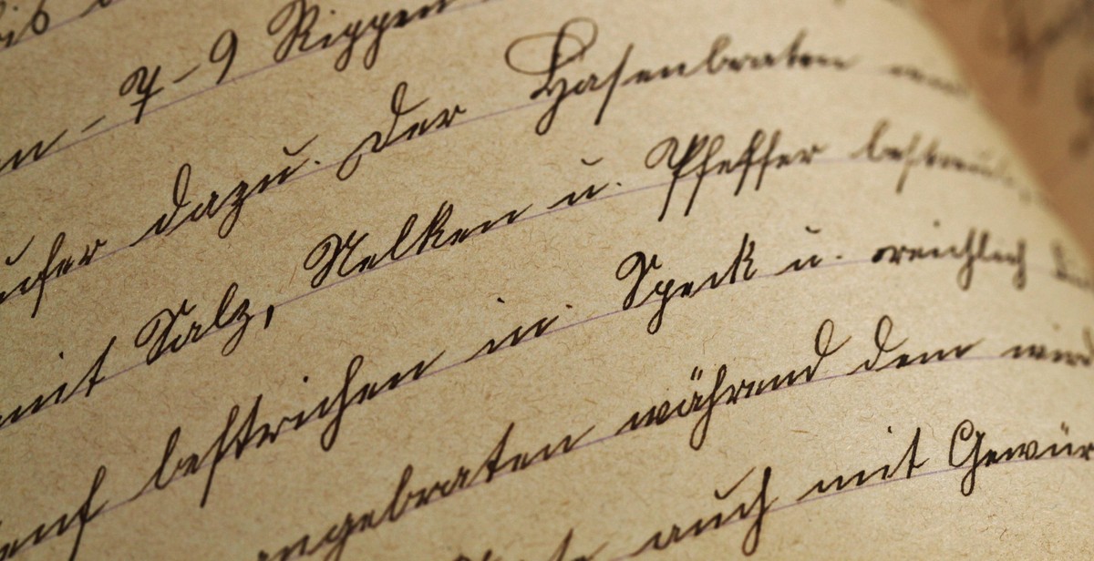
Script fonts mimic handwriting and are often associated with creativity, femininity, and elegance. They are commonly used in wedding invitations, greeting cards, and branding materials for beauty and fashion industries. However, they should be used sparingly and in combination with other fonts to avoid overwhelming the reader.
| Examples of Script Fonts | Characteristics |
|---|---|
| Calligraphy | Artistic, ornate, romantic |
| Brush Script | Bold, casual, playful |
| Lobster | Creative, whimsical, decorative |
Display Fonts
Display fonts are decorative and attention-grabbing. They are often used for headlines, titles, and logos to create a strong visual impact. However, they should be used sparingly and in combination with other fonts to avoid distracting the reader.
| Examples of Display Fonts | Characteristics |
|---|---|
| Impact | Powerful, bold, dramatic |
| Comic Sans | Casual, fun, playful |
| Stencil | Industrial, edgy, military |
Choosing the right fonts for an editorial design requires careful consideration of the content, the target audience, and the overall design aesthetic. A well-designed combination of fonts can enhance the readability, visual hierarchy, and overall impact of the content.

Pairing Fonts
Pairing fonts is an essential aspect of editorial design that can convey information with visual hierarchy. Choosing the right fonts can make or break the design of your editorial piece. There are different ways to pair fonts, including contrasting, complementary, similar, and experimental font pairing.
Contrasting Fonts
Contrasting fonts are fonts that have a different style, weight, or structure. They create a visual hierarchy, making one font stand out more than the other. When pairing contrasting fonts, it’s essential to make sure that they complement each other and do not clash. For example, pairing a bold sans-serif font with a delicate script font can create a striking contrast that captures the reader’s attention.
Complementary Fonts
Complementary fonts are fonts that have a similar structure or style. They create a harmonious and cohesive design that is pleasing to the eye. When pairing complementary fonts, it’s essential to make sure that they do not blend together and become indistinguishable. For example, pairing a sans-serif font with a slightly rounded serif font can create a clean and modern design.
Similar Fonts
Similar fonts are fonts that have a similar structure or style, but with slight variations. They create a subtle visual hierarchy that can be useful in conveying information. When pairing similar fonts, it’s essential to make sure that they have enough contrast to distinguish them from each other. For example, pairing two serif fonts with different weights and slightly different structures can create a sophisticated and elegant design.
Experimental Font Pairing
Experimental font pairing involves pairing fonts that are not typically used together. It can create a unique and memorable design that stands out from the crowd. When experimenting with font pairing, it’s essential to make sure that the fonts complement each other and do not clash. For example, pairing a bold and modern sans-serif font with a vintage and decorative serif font can create an unexpected and exciting design.
Conclusion
Pairing fonts is an essential aspect of editorial design that can convey information with visual hierarchy. Whether you choose to pair fonts that contrast, complement, are similar, or experimental, it’s essential to make sure that they work together to create a cohesive and visually appealing design.

Creating Visual Hierarchy
Visual hierarchy is the arrangement of design elements in a way that guides the viewer’s eye to the most important information first. In editorial design, this is especially important because the goal is to convey information in a clear and concise manner. Fonts play a crucial role in creating visual hierarchy, and there are several factors to consider when pairing fonts.
Font Size
Font size is one of the most important factors in creating visual hierarchy. Larger fonts draw the eye and suggest importance, while smaller fonts are less noticeable and imply less significance. When pairing fonts, it’s important to consider the size of each font in relation to the other. For example, a headline font should be significantly larger than the body text font.
Font Weight
Font weight refers to the thickness of the strokes that make up each letter. Bold fonts are more attention-grabbing than lighter weights, and can be used to add emphasis to important information. However, too much bold text can be overwhelming and difficult to read. It’s important to balance bold and regular weights to create a cohesive and easy-to-read design.
Font Style
Font style refers to the overall look of the font, such as whether it is serif or sans-serif. Serif fonts have small lines or flourishes on the ends of each letter, while sans-serif fonts do not. Serif fonts are often perceived as more traditional and serious, while sans-serif fonts are more modern and casual. When pairing fonts, it’s important to consider the style of each font and how they complement each other.
Font Color
Font color is another important factor in creating visual hierarchy. Darker colors draw the eye and suggest importance, while lighter colors are less noticeable. However, too much contrast between font colors can be jarring and difficult to read. It’s important to choose colors that complement each other and create a cohesive design.
Spacing
Spacing refers to the amount of space between each letter and each line of text. Tight spacing can make text appear cramped and difficult to read, while too much spacing can make it difficult to distinguish between individual words. When pairing fonts, it’s important to consider the spacing of each font and how they work together. Consistent spacing throughout the design will create a more cohesive and professional look.
Alignment
Alignment refers to the way that text is positioned on the page. Left-aligned text is the most common and easiest to read, while center-aligned text can be more visually interesting but more difficult to read. Right-aligned text is the least common and can be difficult to read. When pairing fonts, it’s important to consider the alignment of each font and how they work together. Consistent alignment throughout the design will create a more cohesive and professional look.
| Factor | Importance |
|---|---|
| Font Size | High |
| Font Weight | Medium |
| Font Style | Medium |
| Font Color | Low |
| Spacing | High |
| Alignment | Medium |

Conclusion
Pairing fonts in editorial design is a critical aspect of creating visually appealing and effective communication. It helps to convey information with visual hierarchy, making it easy for readers to understand the message.
When choosing fonts, it is essential to consider the type of content, the audience, and the context. Serif fonts are ideal for print materials and formal documents, while sans-serif fonts are perfect for digital content and informal documents.
Combining fonts can be challenging, but it is essential to create a visual hierarchy that guides readers through the content. The key is to choose fonts that complement each other and create contrast.
It is also crucial to pay attention to font size, weight, and spacing. These elements affect the readability and visual appeal of the content.
By following these guidelines, designers can create visually appealing and effective communication that engages and informs the audience.
Remember, pairing fonts is not just about aesthetics; it is about conveying information effectively. With the right combination of fonts, designers can create a visual hierarchy that guides readers through the content, helping them to understand the message and take action.
